Introduction
XmlLayout allows you to create fully functional user interfaces and UI elements using XML.- Utilise all of the functionality of UnityGUI through XML
- Supports event handling, on any element (onClick, onMouseEnter, onMouseExit, onValueChanged, etc.)
- Easily retrieve form data from multiple elements at once with XmlLayout.GetFormData()
- Access and create Xml Elements dynamically at runtime
- Includes Xml Scheme Definition (XSD) for intellisense support (autocomplete).
- Set default values to be used by other elements (e.g. visual styles)
- Supports an MVC approach, as well as an (new in v1.18) MVVM approach, or anywhere in between - the choice is yours!
If you find XmlLayout useful, please consider leaving a rating/review on the Asset Store Page (it helps a lot!)
Getting Started
Installing XmlLayout
To install XmlLayout, simply download it from the Asset Store and import it into your project.
The default location is Assets/UI/, which is where both XmlLayout and TableLayout will be installed. You can move the UI folder and its contents to a different location if you wish.
Please note: if you are upgrading from a previous version of XmlLayout, as with most Unity assets, it is best if you remove the previous version before importing the new one. Sometimes, files or folders may be removed or moved around within the XmlLayout installation between versions, which isn't covered by Unity's import/update process. While this is fairly rare, it is still safest to remove the existing installation prior to importing a new one.
This is especially important when updating to version v1.79, as several files have been moved and/or renamed.
If you wish to backup your configuration settings, make a backup of the UI/XmlLayout/Configuration/Resources/XmlLayout_Configuration file and then restore it once the import is complete (or, if you haven't deleted the existing files, just skip importing this file).
Additional Note: The UI folder may be moved to a Unity 'Plugins' directory if you wish, in order to prevent it from being recompiled unecessarily. This may help reduce the compilation time for your project.
Alternatively, in Unity 2018 and later, you can use the new 'Generate Assembly Definition Files' option in the configuration section to seperate XmlLayout and its plugins into its own assemblies (which achieves as similar effect).
Additional Note #2: You may need to enable .NET 4.0 when installing XmlLayout as this is required by the MVVM functionality. If you don't want to use MVVM, and you don't want to use .NET 4.0, you can disable the MVVM functionality by clicking the 'Disable MVVM Functionality' button on the XmlLayout configuration object. Once you have done so, you can safely set your players .NET version back to 2.0 if you wish.
As of XmlLayout v1.86, MVVM is now disabled by default and must be enabled if you wish to use it. As a result, you no longer need to disable it in order to work with .NET 2.0, as it is already disabled by default.
</InstallingXmlLayout>
Basic Concepts
XmlLayout parses Xml, and produces fully functional Unity UI elements as a result.
The system comprises of several components:
-
XmlLayout
This is the primary component of the XmlLayout system. It parses the Xml, and produces the resulting UI elements.
-
Xml File (optional)
The XmlLayout component can optionally use an Xml File (highly recommended) instead of specifying the Xml code directly.
-
XmlLayoutController (optional)
The Xml Layout Controller is responsible for:
- Loading dynamic data
- Creating elements dynamically at run-time
- Handling events
Each Xml Layout Controller is a custom class which must be created specifically for the XmlLayout it will be tied to.
Xml Layout Controllers must extend (inherit from) the XmlLayoutController class, which provides several virtual methods you may override to customise the behaviour of the controller.
-
LayoutRebuilt()
This method is called after the XmlLayout object is rebuilt for any reason (e.g. Xml changed, RectTransform dimensions changed, Rebuild on Awake, etc.)
As such, overriding this method is ideal for populating dynamic data fields, creating dynamic elements, and so on.
-
Show()
This method will, by default, show the XmlLayout object. You may override it to add custom behaviour.
-
Hide()
This method will, by default, hide the XmlLayout object. You may override it to add custom behaviour.
</BasicConcepts>
Adding a new XmlLayout object
To add a new XmlLayout object, right-click the desired location in the hierarchy window, and select UI -> XmlLayout -> Add New XmlLayout.
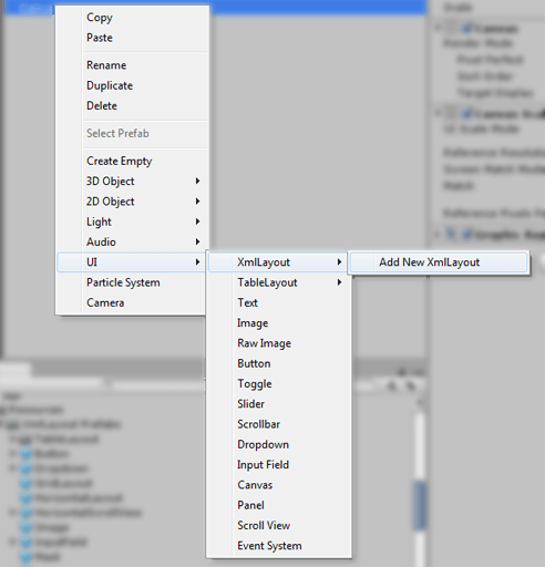
This will then open the 'Add New XmlLayout' Wizard.
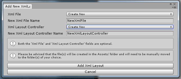
Options
-
Xml File:
- None: The new XmlLayout will not use an Xml File.
- Create New: The new XmlLayout will use a newly-created Xml File.
- Select Existing: The new XmlLayout will use an existing Xml File.
- New Xml File Name: If creating a new Xml File, this field specifies the name of the new file.
-
Xml Layout Controller
- None: The new XmlLayout will not use an Xml Layout Controller.
- Create New: The new XmlLayout will use a newly-created Xml Layout Controller.
- Select Existing: The new XmlLayout will use an existing Xml Layout Controller.
- New Xml Layout Controller Name: If creating a new Xml Layout Controller, this field specifies the name of the new controller.
Once you have made your selections, click the Add Xml Layout button. If you have opted to create a new Xml Layout Controller, the Unity Editor will pause briefly while it re-compiles.
The newly created xml file and/or Xml Layout Controller file will be created in the Assets/ directory - you will need to move them to the directories of your choice.
And there you go, your newly created XmlLayout is ready for you to start coding!
</AddingANewXmlLayoutObject>
The XmlLayout Component
-
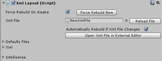
Force Rebuild On Awake
If this is set, then the first time this XmlLayout becomes active in the scene, it will rebuild its contents from the Xml. This may cause a small delay the first time this XmlLayout object becomes active, but it does ensure that everything is always up-to-date.
-
Force Rebuild Now
If this button is clicked, then this XmlLayout will be rebuilt immediately.
-
Xml File
This specifies the Xml file to be used by this XmlLayout. This field is optional - if you wish, you may specify the Xml for this XmlLayout directly.
-
Reload File
If this button is clicked, this XmlLayout's Xml will be updated to match the contents of the Xml File, and then this XmlLayout will be rebuilt.
-
Automatically Rebuild If Xml File Changes
If this is set, then whenever the Xml File is changed externally (for example, in Visual Studio), then so long as the Editor is running and this project is open, this XmlLayout will be updated to match.
Please note that this will also occur if the editor is running in Play mode, but once you return to Edit mode, the changes will be lost - so it will be necessary to click the 'Reload File' button in order to make the changes permanent.
-
Open Xml File in External Editor
Clicking this button will open the Xml File in the external editor that the Unity Editor has been configured to use (i.e. Visual Studio or MonoDevelop).
-
Defaults Files
This is an optional list of Xml files to load default element values from (See the 'Defaults' tag). Defaults files can also be specified within the Xml (See the 'Include' tag).
-
Xml
This field allows you to manually specify the Xml used by this XmlLayout object.
- Update Element: Clicking this button will update the XmlLayout element to match the updated Xml.
- Save Changes to Xml File: Clicking this button will save any changes made to the Xml File.
-
Intellisense
This section allows you to view/edit the XSD document used by XmlLayout, should you wish to do so.
</TheXmlLayoutComponent>
Autocomplete / Intellisense
Visual Studio / MonoDevelop loads the XmlLayout intellisense data from an XSD document located in:
UI/XmlLayout/Configuration/XmlLayout.xsd
As such, each XmlLayout XmlLayout tag should be set up as follows, where xsi:schemaLocation is the relative path from the Xml File to the XSD document.
<XmlLayout xmlns="XmlLayout"
           xmlns:xsi="http://www.w3.org/2001/XMLSchema-instance"
           xsi:schemaLocation="XmlLayout UI/XmlLayout/Configuration/XmlLayout.xsd">
</AutocompleteIntellisense>
Forcing a Layout Rebuild via C#
From time to time, it may be necessary to instruct XmlLayout to rebuild it's layout if, for example, the Xml has been changed. To do so, simply call XmlLayout's 'RebuildLayout()' method. If the Xml has not been changed, but you wish for XmlLayout to rebuild anyway (which may in some rare cases be necessary), then call 'RebuildLayout(true)' instead.
</ForcingALayoutRebuildViaC>
Event Handling
Most Xml Elements provide the onClick, onMouseEnter, and onMouseExit event-handlers.
Elements which are used to input values (such as InputField, Slider, Toggle, etc.) provide an additional event-handler: onValueChanged.
Additionally, some elements have unique event-handlers, such as InputField's onEndEdit.
All events will be triggered on the XmlLayout's XmlLayoutController - as such, event-handling can only be used on XmlLayout elements with a controller attached.
Event field structure:
MethodName(optional argument);
The semi-colon is optional, as are the brackets if no argument is specified.
Example Xml
<!-- XmlLayoutController.ButtonClicked() will be called when this button is clicked -->
<Button onClick="ButtonClicked();">Button Text</Button>

<!-- Whenever this slider's value changes, XmlLayoutController.SliderValueChanged(x)
     will be called, where 'x' is the new value -->
<Slider onValueChanged="SliderValueChanged(selectedValue);" />

<!-- The XmlLayoutController.HighlightButton() and XmlLayoutControllerClearButtonHighlight() methods
     will be called when the mouse enters and exits this element.
     The button itself will be passed as an argument. -->
<Button onMouseEnter="HighlightButton(this);" onMouseExit="ClearButtonHighlight(this);">Button Text</Button>

<!-- XmlLayoutController.ButtonClickedTwo(aStringValue) will be called when this button is clicked -->
<Button onClick="ButtonClickedTwo(aStringValue);">Button Text</Button>
Defining methods to receive events in the controller:
Methods which receive events from the XmlLayout will be located within the XmlLayoutController through the use of Reflection. It is not necessary for the methods to be public (although they can be, should you wish to make them).
The event-handling code will attempt to convert any arguments into the type the method expects, e.g. if the method expects an integer, then the value provided will be parsed first.
You may name your event-receiving methods whatever you wish, and you may even call inherited methods (such Show() and Hide()) if you wish.
Special Arguments
By default, arguments will simply be converted to the required type, e.g. if a value of 'xyz' is passed by the Xml as the argument, and the method expects a string, then the method will just be passed the 'xyz' value as a string. However, some string values have special meanings:
- this: The game object which raised the event will be passed as an argument. The event-handling code will attempt to convert it into the type required by the method, through the use of gameObject.GetComponent().
- value: (InputField only) The current text value of this InputField.
- selectedValue: (Toggle/ToggleButton/ToggleGroup/Slider) The currently selected int/float value of this element.
- selectedIndex: (Dropdown only) The currently selected index of this Dropdown element.
- selectedText / selectedValue: (Dropdown only) The currently selected text value of this Dropdown element.
- xy: (Scrollviews only) A Vector2() representing this scrollview's current x and y values.
- x: (Scrollviews only) A float representing this scrollview's current x value.
- y: (Scrollviews only) A float representing this scrollview's current y value.
Example Controller
void ButtonClicked()
{
    Debug.Log("The button was clicked.");
}

void SliderValueChanged(float newValue)
{
    Debug.Log("The slider's value was changed to " + newValue + ".");
}

void HighlightButton(Button button)
{
    // Code to highlight the button
}

void ClearButtonHighlight(Button button)
{
    // Code to clear the button highlight
}

void ButtonClickedTwo(string stringValue)
{
    // Will output: 'ButtonClickedTwo - value received = 'aStringValue'
    Debug.Log("ButtonClickedTwo - value received = '" + stringValue + "'");
}
</EventHandling>
Creating elements dynamically
There are several methods which you can use to create elements dynamically.
The easiest, and perhaps the most efficient, is to create a hidden template element and clone it, as done in the Example Menu and Shop examples.
This works well, because you can easily style and clone the template as with any other Xml element.
While not strictly necessary, it is recommended that you add dynamically created elements to layout groups to minimise the effort it takes to position and scale them.
Example Xml
<VerticalLayout padding="10" spacing="10" id="menuButtons">
    <!-- This is a template which will be used by the XmlLayoutController to create the menu buttons dynamically -->
    <Button id="menuButtonTemplate" active="false"></Button>
</VerticalLayout>
Example Controller
public override void LayoutRebuilt(ParseXmlResult parseResult)
{
    if (parseResult != ParseXmlResult.Changed) return;

    // get the menu button container
    menuButtonGroup = xmlLayout.GetElementById("menuButtons");

    // get the menu button template so that we can clone it
    var menuButtonTemplate = xmlLayout.GetElementById("menuButtonTemplate");

    // in this case, 'Examples' is populated in the editor
    foreach (var example in Examples)
    {
        var name = example.name;

        // Create a copy of the template
        var menuButton = GameObject.Instantiate(menuButtonTemplate);
        menuButton.name = name;

        // Access the XmlElement component and initialise it for this new button
        var xmlElement = menuButton.GetComponent<XmlElement>();
        xmlElement.Initialise(xmlLayout, (RectTransform)menuButton.transform, menuButtonTemplate.tagHandler);

        // Add the xmlElement to the menuButtonGroup
        menuButtonGroup.AddChildElement(menuButton);

        // Set the necessary attributes, and Apply them
        xmlElement.SetAttribute("text", name);
        // the template is inactive (so as not to be visible), so we need to activate this button
        xmlElement.SetAttribute("active", "true");
        // Call the SelectExample function (in this XmlEventReceiver) when this button is clicked
        xmlElement.SetAttribute("onClick", "SelectExample(" + name + ");");
        xmlElement.ApplyAttributes();
    }
}
</CreatingElementsDynamically>
Working with form data
Receiving values for individual elements using event-handlers is easy, but what if you need to retrieve the values of multiple elements at once (e.g. for a login form, or an options menu)?
To this end, XmlLayout provides the GetFormData() method, which returns the values of all the form elements in a Dictionary<string,string> (where they key is the id value of the element).
The Options Menu example demonstrates how form data can be read easily using XmlLayout.GetFormData().
</WorkingWithFormData>
Tooltips
New in V1.02Tooltips can be set for any element using the tooltip attribute. This attribute does support rich text, although tags such as color, size, b, or i must first be HTML-encoded (this is not necessary if the tooltip is specified dynamically using code, only if defined within an Xml file).
Tooltips can be styled directly on the element (using the various attributes provided, or they may be styled for all elements using the special Tooltip tag within a defaults section.
Tooltips will always have their position clamped within their canvas, so that they never appear partially off-screen.
Example
<Defaults>
<!-- Set the default tooltip border and text colors for all tooltips
(except in cases where the element (or element style) overrides the value) -->
<Tooltip tooltipBorderColor="rgb(1,1,1)" tooltipTextColor="rgb(1,1,1)" />
</Defaults>
<!-- Simple tooltip positioned below the element -->
<Button tooltip="This is a simple tooltip" tooltipPosition="Below"></Button>
<!-- Tooltip with encoded rich text (<color=green>green</color>) -->
<Button tooltip="This tooltip has some <color=green>green</color> text."></Button>Attributes (Click to show/hide)
| Name | Description | Type / Options | Default Value |
|---|---|---|---|
| tooltip | Tooltip text. | string | |
| tooltipBorderColor | Color of the tooltips border. | color | white |
| tooltipBackgroundColor | Color of the tooltips background | color | rgba(0,0,0,0.62) |
| tooltipTextColor | Color of the text within this tooltip | color | |
| tooltipPosition | Position of this tooltip in relation to the element. |
| Right |
| tooltipBorderImage | This attribute allows you to override the default image used for the tooltips border. | path/to/image | |
| tooltipBackgroundImage | This attribute allows you to override the default image used for the tooltips background. | path/to/image | |
| tooltipOffset | This attribute allows you to modify the distance this tooltip will appear from the element. | float |
</Tooltips>
XmlLayout Tags
Attribute types
Most attribute value types are straightforward, however, there are a few which warrant an explanation.
-
Color
For color values, several formats are acceptable:
- HTML (6 character hex) color codes e.g.
#FFFFFF(white 100% opacity) - 8 character hex color codes e.g.
#FFFFFFCC(white 80% opacity) - RGB color codes: e.g.
rgb(1,1,1)(white 100% opacity) - RGBA color codes: e.g.
rgba(1,1,1,0.8)(white 80% opacity)
- HTML (6 character hex) color codes e.g.
-
Color Block
Color block values are used to specify the colors for elements such as buttons and input fields.
Format: (normalColor|highlightedColor|pressedColor|disabledColor) where each color is formatted as above, e.g.
#FFFFFF|#FFFFFF|#C8C8C8|rgba(0.78,0.78,0.78,0.5) -
Paths
All paths are passed through Unity'sResources.Load(), and as such any referenced Sprites, AudioClips, Prefabs, etc. must be located within a Resources folder.As of v1.23, you can create custom resource collections, allowing you to reference assets outside of a Resources folder if you wish.
-
Bool
Boolean attributes can accept
1(true),true,0(false), orfalse. -
RectOffset
RectOffsets, e.g. padding, accept the following formats:
- float(left) float(right) float(top) float(bottom) e.g.
5 5 10 10(padding value of 5 on the left and right sides, and 10 on the top and bottom) - float (all sides) e.g.
10(padding value of 10 on all sides)
- float(left) float(right) float(top) float(bottom) e.g.
</AttributeTypes>
Common Attributes
Attributes (Click to show/hide)
| Name | Description | Type / Options | Default Value |
|---|---|---|---|
| Identification | |||
| id | Specifies an id for this element which can be used to access it later on, via XmlLayout.GetElementById(). This value should be unique within each XmlLayout. | string | |
| internalId | Specifies an internal id for this element which can be used to access it later on, via XmlElement.GetElementByInternalId(). This can be used to access child elements of any XmlElement. | string | |
| name | Specifies the name of this element within the Unity Hierarchy. | string | |
| Defaults | |||
| class | Specifies the class(es) of this element, which allows you to use default values defined within a | list of classes separated by spaces | |
| Active | |||
| active | Specifies whether or not this element is active. | bool | true |
| Image (Only applies to elements with an image component) | |||
| image | Image to use for this element | Path/To/Image | Varies per element |
| preserveAspect | Should the aspect ratio of this image be preserved? | bool | Varies per element |
| color | Color for this element's image | color | clear or #FFFFFF |
| type | Image Type |
| Varies per element, usually 'Sliced' |
| raycastTarget | Should this element block raycasts or not? | bool | true |
| Event Handling | |||
| Note: all mouse events support a special parameter called 'pointerId', which you can use as an argument for the event in order to determine which mouse button was used. | |||
| onClick | Defines a method to be called when this element is clicked. | MethodName(argument); | |
| onMouseEnter | Defines a method to be called when the mouse enters this element. | MethodName(argument); | |
| onMouseExit | Defines a method to be called when the mouse exits this element. | MethodName(argument); | |
| onMouseDown | Defines a method to be called when the mouse button is clicked while over this element. | MethodName(argument); | |
| onMouseUp | Defines a method to be called when the mouse button is released while over this element. | MethodName(argument); | |
| onElementDropped | Defines a method to be called when an element that is being dragged is dropped on this element. The XmlElement being dropped and the XmlElement it is dropped on will be passed as arguments to the method. | MethodName(); | |
| isDropReceiver | Specifies whether or not this method can receive dragged elements that are dropped on it. | bool | false |
| Appearance | |||
| shadow | Defines the shadow color of this element | color | None |
| shadowDistance | Defines the distance of the shadow for this element | float(x) float(y) | 1 -1 |
| outline | Defines the outline color of this element | color | None |
| outlineSize | Defines the size of this elements outline | float(x) float(y) | 1 -1 |
| prefabPath | Allows you to use a non-standard prefab for any element. | Path/To/Prefab | Varies per element |
| Layout Elements (Only applies to elements within a layout group) | |||
| ignoreLayout | Should this element ignore its parent layout group? | bool | false |
| minWidth | Minimum width for this element | float | |
| minHeight | Minimum height for this element | float | |
| preferredWidth | Preferred width for this element | float | |
| preferredHeight | Preferred height for this element | float | |
| flexibleWidth | Should the width of this element be flexible? |
| |
| flexibleHeight | Should the height of this element be flexible? |
| |
| Position and Size (Simple) | |||
| rectAlignment | Defines this elements position within its parent. Only applies to elements not contained within layout groups. |
| MiddleCenter |
| width | Defines the width of this element. |
| 100% |
| height | Defines the height of this element. |
| 100% |
| offsetXY | Defines an offset to the position of this element, e.g. a value of -32 0 will cause this element to be 32 pixels to the left of where it would otherwise be. | float (x) float (y) | 0 0 |
| contentSizeFitter | Adds a Unity Content Size Fitter to this element, using the specified direction(s), using the 'PreferredSize' fitting option. |
| none |
| Position and Size (Advanced RectTransform properties) | |||
| anchorMin | float(x) float(y) | ||
| anchorMax | float(x) float(y) | ||
| sizeDelta | float(x) float(y) | ||
| pivot | float(x) float(y) | ||
| rotation | float(x) float(y) float(z) | ||
| scale | float(x) float(y) | ||
| offsetMin | Note: not in autocomplete file until version v1.12 (but will work nonetheless) | float(left) float(bottom) | |
| offsetMax | Note: not in autocomplete file until version v1.12 (but will work nonetheless) | float(right) float(top) | |
| Dragging | |||
| allowDragging | Allow this element to be dragged? (Note: does not work on child elements of layout groups) | bool | false |
| restrictDraggingToParentBounds | Prevent this element from being dragged outside of its parent? | bool | true |
| returnToOriginalPositionWhenReleased | If this is set to true, then the element will return to its original postition when it is released. | bool | true (most elements) |
| onDrag | Defines a method to be called while the element is being dragged. | MethodName(); | |
| onBeginDrag | Defines a method to be called when the element starts being dragged. | MethodName(); | |
| onEndDrag | Defines a method to be called when the element is released. | MethodName(); | |
| Animation | |||
| showAnimation |
| None | |
| hideAnimation |
| None | |
| showAnimationDelay | Adds a short delay before playing this element's show animation. | float | 0 |
| hideAnimationDelay | Adds a short delay before playing this element's hide animation. | float | 0 |
| animationDuration | Specifies how long show/hide animations should take to play. | float | 0.25 |
| animationController | Allows you to specify an alternate AnimationController to use in place of XmlLayout's default AnimationController (which will allow you to use your own custom animations, but will also mean that you will lose access to the default animation set, with the exception of slide in/out animations) | Path/To/AnimationController | |
| Audio | |||
| onClickSound | Audioclip to play when this element is clicked. | Path/To/AudioClip | None |
| onMouseEnterSound | Audioclip to play when the mouse enters this element. | Path/To/AudioClip | None |
| onMouseExitSound | Audioclip to play when mouse exits this element. | Path/To/AudioClip | None |
| audioVolume | Volume to play Click/MouseEnter/MouseExit Audioclips at. | float | 1 |
| Navigation (see Unity Navigation Documentation) | |||
| selected | Should this item be selected/focused by default? Please note that only one item can be focused at a time. | boolean | false |
| navigation | Navigation type for this element |
| Automatic |
| selectOnUp | (Explicit Navigation) Element to select when moving up (default key: Shift + Tab) | Element id | |
| selectOnDown | (Explicit Navigation) Element to select when moving down (default key: Tab) | Element id | |
| selectOnLeft | (Explicit Navigation) Element to select when moving left | Element id | |
| selectOnRight | (Explicit Navigation) Element to select when moving right | Element id | |
</CommonAttributes>
XmlLayout
The XmlLayout tag is the root tag of any XmlLayout Xml document - it must be present, and only elements contained within the XmlLayout tag will be parsed.
Attributes (Click to show/hide)
| Name | Description | Type / Options | Default Value |
|---|---|---|---|
| xmlns | http://www.w3schools.com | ||
| xmlns:xsi | http://www.w3.org/2001/XMLSchema-instance | ||
| xsi:noNamespaceSchemaLocation | Relative Path to XmlLayout.xsd |
</XmlLayout>
Defaults
The defaults Tag allows you to set default values for UI elements. Primarily this will be used to set styles and the like, but there is no restriction on what default values you can set.
Defaults can be applied to all instances of a particular tag type, or only those of a particular class (as set by the class attribute). Please note that elements may use more than one class (separated by spaces).
As with its HTML counterpart (CSS), XmlLayout Defaults are applied in a cascading fashion. This means that an element will always use the most recent value for an attribute - for example, if an element implements a class, it will use the attribute values defined by that class except when the element itself also defines those attributes (attributes defined on the element will always take precedence).
Defaults tags can be placed anywhere in the Xml document, but will only apply to elements after it.
Example
<Defaults>
    <!-- Set the default color and font size for all Text elements -->
    <Text color="#DDDDDD" fontSize="16" />

    <!-- Set the default color for all Text elements using the 'darker' class -->
    <Text class="darker" color="#AAAAAA" />

    <!-- Set the default background image for all Button images -->
    <Button image="Sprites/Layout/Button" />
</Defaults>

<!-- This text's color will be "#DDDDDD" and its font size will be "16" -->
<Text>Text</Text>

<!-- This text's color will be "#AAAAAA" and its font size will be "16" -->
<Text class="darker">Text</Text>

<!-- This button will use the background image "Sprites/Layout/Button" -->
<Button>Button Text</Button>

<!-- Set the default border and text color for all tooltips -->
<Tooltip tooltipBorderColor="rgb(1,1,1)" tooltipTextColor="rgb(1,1,1)" />
Attributes
NoneNested Defaults
New in v1.44
In a similar fashion to CSS, you can now define nested defaults/styles for elements which will allow you to create more advanced default value definitions.
These definitions specify default values which should only be applied to elements which match the specified conditions, such as being contained by another element, so, for example, you can now apply styles to all buttons in a specific list without having to set a class for each one.
Descendant Operators
Descendant operators specify how the nested defaults rules are applied:
:- If this operator is used, then so long as the element is a descendant of the specified parent, then the defaults values will be applied to it, even if the element is not a direct child of the specified parent.>- If this operator is used, then the defaults values will only be applied to the element if it is a direct child of the specified parent.
Class/Type operators
@- If this operator is used, then XmlLayout will match by tag type, rather than by class name.- If no operator is used, then XmlLayout will match using class names.
Example
<Defaults>
    <!-- All Buttons have a fontSize of 30 -->
    <Button fontSize="30" />

    <!-- All Buttons using the class 'myButton' will be red -->
    <Button class="myButton" colors="red" />

    <!-- All Buttons that are within a VerticalLayout, at any level,
         will have yellow text with a black outline -->
    <Button class="@VerticalLayout:@Button" textOutline="black" textColor="yellow" />

    <!-- Buttons using the class'myButton' that are nested within a Panel,
         which is a direct child of a VerticalLayout, will be green -->
    <Button class="@VerticalLayout>@Panel:myButton" colors="green" />

    <!-- Buttons using the class 'myButton', that are nested directly
         within an element using the 'myPanel' class, which is nested directly
         in a VerticalLayout, will have white text -->
    <Button class="@VerticalLayout>myPanel>myButton" textColor="white" />

  </Defaults>


  <Panel height="50%" rectAlignment="UpperCenter">
    <!-- This button will be red, and have black text -->
    <Button class="myButton" text="Red / Black Text" />
  </Panel>


  <Panel height="50%" rectAlignment="LowerCenter">
    <VerticalLayout>

      <Panel class="myPanel">
        <!-- This button will be green, and will have white text -->
        <Button class="myButton" text="Green / White Text" />
      </Panel>

      <!-- This button will be red, and have yellow text -->
      <Button class="myButton" text="Red / Yellow Text" />

      <!-- This button will be white, and have yellow text -->
      <Button text="White / Yellow Text" />

    </VerticalLayout>
  </Panel>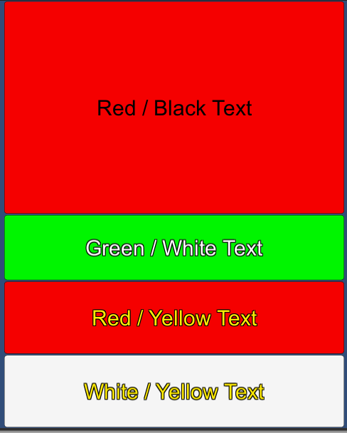
Named Colors
As of v1.53, you can now define your own custom named colors to use in your XmlLayout code.
Named colors can only be defined within a defaults section
Example
<Defaults>
    <Color name="primary" color="rgb(0.5,0.5,0.5)" />
    <Color name="highlight" color="rgb(0.5,0.5,0.75)" />
    <Color name="text" color="rgb(1,1,1)" />

    <Panel color="primary" />
    <Panel class="highlighted" color="highlight" />

    <Button textColor="text" />
    <Text color="text" />
</Defaults>
Custom Animations
As of v1.85, you can now define your own custom named animations to use for showing and/or hiding elements.
Custom animations can only be defined within a defaults section.
Example
<Defaults>
    <Animation name="FadeInLinear"
               duration="0.5"
               attribute="CanvasGroup.alpha"
               from="0"
               to="1"
               valueType="float"
               curve="Linear" />
</Defaults>


<!-- Use the newly defined 'FadeInLinear' animation to show this button -->
<Button showAnimation="FadeInLinear" ... />
Animation Chains
Animations can also be chained, i.e. you can define an animation which consists of a set of other animations that are played one after the other.
The chain can consist of any number of animations, but it can only use other custom animations (it cannot reference built-in animations like Grow, Shrink, etc.)
Chained Animation Example
<Defaults>
    <Animation name="GrowExpo"
               duration="1"
               attribute="RectTransform.localScale"
               from="0 0 0"
               to="1 1 1"
               valueType="Vector3"
               curve="ExpoEaseIn" />

    <Animation name="ChangeColor"
               duration="1"
               attribute="Image.color"
               from="rgb(1,1,1)"
               to="rgb(1,0.2,0.2)"
               valueType="Color" />

    <!-- Grow, then change color -->
    <Animation name="GrowThenChangeColor" type="Chained" animations="GrowExpo ChangeColor" />
</Defaults>

<Button showAnimation="GrowThenChangeColor" ... />
Simultaneous Animations
Animations can also be played simultaneously, i.e. you can define an animation which consists of a set of other animations that are played at the same time on the same element.
Any number of animations can be played simultaneously, but as with animation chains, it can only reference other custom animations. Additionally, it can only reference single animations - it will not function correctly with references to chains or other simultaneous animations.
Simultaneous Animation Example
<Defaults>
    <Animation name="GrowExpo"
               duration="1"
               attribute="RectTransform.localScale"
               from="0 0 0"
               to="1 1 1"
               valueType="Vector3"
               curve="ExpoEaseIn" />

    <Animation name="ChangeColor"
               duration="1"
               attribute="Image.color"
               from="rgb(1,1,1)"
               to="rgb(1,0.2,0.2)"
               valueType="Color" />

    <!-- Grow AND change color at the same time -->
    <Animation name="GrowAndChangeColor" type="Simultaneous" animations="GrowExpo ChangeColor" />
</Defaults>

<Button showAnimation="GrowAndChangeColor" ... />
Curves
Animation curves specify how the values of your property should change over time. The default 'Linear' curve changes the value of the property evenly over time, whereas other curves change the value differently over time to create interesting effects. You may wish to experiment with different curves in your animations to see what gives the best end-result.
For an idea of how these curves look, see this link.
XmlLayout currently has the following curves available (more may be added in the future if there is demand for them):
- Linear (Default - Unity Standard AnimationCurve.Linear)
- EaseInOut (Unity standard AnimationCurve.EaseInOut)
- ExpoEaseIn
- ExpoEaseOut
- CubicEaseIn
- CubicEaseOut
- ElasticEaseIn
- ElasticEaseOut
- BounceEaseIn
- BounceEaseOut
- BounceEaseInOut
- BounceEaseOutIn
- BackEaseIn
- BackEaseOut
Attributes (Click to show/hide)
| Name | Description | Type / Options | Default Value |
|---|---|---|---|
| name | Name of this animation (required) | string | |
| duration | Duration of this animation in seconds | float | 0.25f |
| attribute | Component and property targeted by this animation. Can target any top-level property of any component on the element. (Required) | NameOfComponent.NameOfProperty e.g. RectTransform.localScale CanvasGroup.alpha Image.color etc. | |
| from | Initial value (optional, but recommended - if no value is provided, then it will use the value the property has at the beginning of the animation) | (depends on valueType) | Value of the property at the start of the animation (or animation chain). |
| to | Final value (required) | (depends on valueType) | |
| valueType | Specifies what type of value will be used for this animation. |
| float |
| curve | What type of curve should be used for this animation? | Linear | |
| type | What type of animation definition is this? |
| Normal |
| animations | List of animations for Chained and Simultaneous types | Animation names separated by spaces (custom animations only) |
Hover / Press / Select Classes
The 'hoverClass' attribute allows you to define a defaults class to be applied to an element (or class) when it is hovered over with the pointer or highlighted.
Similarly, the 'pressClass' allows you to define a defaults class to be applied to an element (or class) when it is pressed (clicked on), and 'selectClass' defines attributes to apply when the element is selected (e.g. Tab Selection).
In both cases, attributes applied via the hover or press class will be removed when the element leaves the highlighted / pressed state.
Please note that in order for hover/press classes to work, the element must block raycasts.
Example
<Defaults>
    <!-- Firstly, suppress the default button 'ColorTint' behaviour by setting 'transition' to None -->

    <!-- Specify the default color for buttons in their usual state (in this case, 'white'),
         and the default text color (in this case, 'black') -->

    <!-- Then, specify that buttons use the 'hover', 'press',
         and 'select' classes for their respective states -->
    <Button hoverClass="hover"
            pressClass="press"
            selectClass="select"
            color="white"
            textColor="black"
            transition="None" />

    <!-- When hovered over, make the button grey, and make the text color blue -->
    <Button class="hover" color="grey" textColor="blue" />

    <!-- When pressed, make the button cyan -->
    <Button class="press" color="cyan" />

    <!-- When selected, make the button red -->
    <Button class="select" color="red" />
  </Defaults>
Please note that the above example shows how you can change some attributes. This can be used on any element, not just buttons, but when using it with a Selectable element such as buttons which provide state transition attributes, please note that it is probably best to use one or the other (e.g. mixing and matching 'colors' and hover/press/select class) as it might be confusing to try and use both approaches simultaneously.
You may also notice that in the example, default values have been specified for both color and textColor, even though the values provided are the regular default values for button elements - the reason for this is that providing default values aids XmlLayout in returning attributes to their default value when changing state, e.g. returning to default state from hover. If no default attribute values are provided, XmlLayout will try and use default values for the attribute type, but this may not necessarily be the desired effect.
</Defaults>
Include
The Include tag allows you to load the contents of another XmlFile and include them within the current Xml document. This is commonly used to load Defaults files, but can be used to include any other Xml document.
Example
<Include path="Xml/Styles.xml" />Attributes (Click to show/hide)
| Name | Description | Type / Options | Default Value |
|---|---|---|---|
| path | Specifies the path to the Xml file. Please note that the Xml file must be located within a Resources folder. | Path/To/XmlFile |
</Include>
ChildXmlLayout
This tag allows you to create a child XmlLayout using the specified view and (optional) controller.
NOTE: if the parent view is rebuilt for any reason, the child will be recreated from scratch as with any other nested Xml element.
Example
<ChildXmlLayout viewPath="Path/To/View" controller="NameOfControllerClass" />Attributes (Click to show/hide)
| Name | Description | Type / Options | Default Value |
|---|---|---|---|
| viewPath | The path to the view Xml file for the child XmlLayout. | Path/To/View | |
| controller | The name of the controller class to use. (optional) | Name Of Controller class (including namespace where applicable) |
</ChildxmlLayout>
Basic Elements
Text
The text tag is a Unity UI Text object.
This tag supports Rich Text as shown in the following example:
Example
<!-- Standard Text element -->
<Text>Some Text</Text>

<!-- Rich Text -->
<Text>
    This text is <b>Bold</b>, <i>Italic</i>,
    and <textcolor color="#00FF00">Green</textcolor>.
    <br>
    This text is <textsize size="18">Larger</textsize>.
</Text>
Attributes (Click to show/hide)
| Name | Description | Type / Options | Default Value |
|---|---|---|---|
| alignment |
| MiddleCenter | |
| color | color | #323232 | |
| font | Path to font resource | Arial | |
| fontStyle |
| Normal | |
| fontSize | float | 14 | |
| resizeTextForBestFit | Resize text to fit? | bool | false |
| resizeTextMinSize | Minimum font size | float | 10 |
| resizeTextMaxSize | Maximum font size | float | 40 |
| horizontalOverflow |
| Overflow | |
| verticalOverflow |
| Truncate |
Image
The image tag is a Unity UI Image object.
Example
<Image image="Path/To/Image" />Attributes (Click to show/hide)
| Name | Description | Type / Options | Default Value |
|---|---|---|---|
| image | Path/To/Sprite | None | |
| color | Color | #FFFFFF | |
| type | Image Type |
| Simple |
| raycastTarget | Should this image block raycasts or not? | bool | true |
RawImage
The RawImage tag is a Unity UI RawImage object.
Example
<RawImage texture="Path/To/Image" />Attributes (Click to show/hide)
| Name | Description | Type / Options | Default Value |
|---|---|---|---|
| texture | Path/To/Texture/Or/Sprite | ||
| color | Color | #FFFFFF | |
| material | Path/To/Material | ||
| raycastTarget | Should this image block raycasts or not? | bool | true |
| uvRect | UV Coordinates to use for this RawImage. | rect e.g. 'x y width height' |
</BasicElements>
Layout Elements
Panel
The panel tag is a simple layout element.
Example
<Panel>
    <Text>Text contained within Panel</Text>
</Panel>
Attributes (Click to show/hide)
| Name | Description | Type / Options | Default Value |
|---|---|---|---|
| padding | Specifies the padding for this panel. Please note that if padding is specified, the panel will function as a LayoutGroup (which it does not do by default). | float(left) float(right) float(top) float(bottom) | None |
HorizontalLayout
The HorizontalLayout tag is a Unity UI HorizontalLayoutGroup object.
Example
<HorizontalLayout>
    <Button>Button One</Button>
    <Button>Button Two</Button>
    <Button>Button Three</Button>
</HorizontalLayout>
Attributes (Click to show/hide)
| Name | Description | Type / Options | Default Value |
|---|---|---|---|
| padding | float(left) float(right) float(top) float(bottom) | 0 0 0 0 | |
| spacing | Spacing between child elements | float | 0 |
| childAlignment |
| UpperLeft | |
| childForceExpandWidth | bool | true | |
| childForceExpandHeight | bool | true |
VerticalLayout
The VerticalLayout tag is a Unity UI VerticalLayoutGroup object.
Example
<VerticalLayout>
    <Button>Button One</Button>
    <Button>Button Two</Button>
    <Button>Button Three</Button>
</VerticalLayout>
Attributes (Click to show/hide)
| Name | Description | Type / Options | Default Value |
|---|---|---|---|
| padding | float(left) float(right) float(top) float(bottom) | 0 0 0 0 | |
| spacing | Spacing between child elements | float | 0 |
| childAlignment |
| UpperLeft | |
| childForceExpandWidth | bool | true | |
| childForceExpandHeight | bool | true |
GridLayout
The GridLayout tag is a Unity UI GridLayoutGroup object.
Example
<GridLayout>
    <Button>Button One</Button>
    <Button>Button Two</Button>
    <Button>Button Three</Button>
</GridLayout>
Attributes (Click to show/hide)
| Name | Description | Type / Options | Default Value |
|---|---|---|---|
| padding | float(left) float(right) float(top) float(bottom) | 0 0 0 0 | |
| spacing | Spacing between child elements | float(x) float(y) | 0 0 |
| cellSize | float(x) float(y) | 100 100 | |
| startCorner |
| UpperLeft | |
| startAxis |
| Horizontal | |
| childAlignment |
| UpperLeft | |
| constraint |
| Flexible | |
| constraintCount | integer | 2 |
TableLayout
The TableLayout tag is a layout element based on HTML tables, allowing you to specify the position of elements in specific rows/columns.
Example
<TableLayout>
    <!-- Row 1 -->
    <Row>
        <Cell><Button>Button One</Button></Cell>
        <Cell><Button>Button Two</Button></Cell>
    </Row>
    <!-- Row 2 -->
    <Row>
        <Cell><Button>Button One</Button></Cell>
        <Cell><Button>Button Three</Button></Cell>
    </Row>
</TableLayout>
Attributes (Click to show/hide)
| Name | Description | Type / Options | Default Value |
|---|---|---|---|
| padding | float(left) float(right) float(top) float(bottom) | 0 0 0 0 | |
| cellSpacing | Spacing between each cell. | float | 0 |
| columnWidths | (Optional) Explicitly set the width of each column. Use a value of 0 to auto-size a specific column. | float list - e.g. '32 0 0 32' | |
| automaticallyAddColumns | If more cells are added to a row than are accounted for by columnWidths, should this TableLayout automatically add one or more new auto-sized entries (0) to columnWidths? | bool | true |
| automaticallyRemoveEmptyColumns | If there are more entries in columnWidths than there are cells in any row, should this TableLayout automatically remove entries from columnWidths until their are no 'empty' columns? | bool | true |
| autoCalculateHeight | If set to true, then the height of this TableLayout will automatically be calculated as the sum of each rows preferredHeight value. This option cannot be used without explicitly sized rows. | bool | false |
| useGlobalCellPadding | If set to true, then all cells will use this TableLayout's cellPadding value. | bool | true |
| cellPadding | Padding for each cell. | float(left) float(right) float(top) float(bottom) | 0 0 0 0 |
| cellBackgroundImage | Image to use as the background for each cell. | Path/To/Sprite | Sprites/Outline_Sharp |
| cellBackgroundColor | Color for each cells background image. | color | rgba(1,1,1,0.4) |
| useAlternateCellBackgroundColors | Should alternate cells use different colors? | bool | false |
| cellBackgroundColorAlternate | Color for each alternate cells background image (if useAlternateCellBackgroundColors is true). | color | rgba(1,1,1,0.4) |
| rowBackgroundImage | Image to use as the background for each row. | Path/To/Sprite | None |
| rowBackgroundColor | Color to use for each rows background image. | color | clear |
| useAlternateRowBackgroundColors | Should alternate rows use different colors? | bool | false |
| rowBackgroundColorAlternate | Color to use for each alternate rows background image (if useAlternateRowBackgroundColors is true). | color | clear |
Row
A row within a TableLayout.
Attributes (Click to show/hide)
| Name | Description | Type / Options | Default Value |
|---|---|---|---|
| preferredHeight | Sets the height for this row. Use a value of '0' to specify that this row should be auto-sized. | float | 0 |
| dontUseTableRowBackground | If set to true, then this row will ignore the tables' rowBackgroundImage and rowBackgroundColor values, allowing you to override those values for this row. | bool | false |
Cell
A cell within a TableLayout.
Attributes (Click to show/hide)
| Name | Description | Type / Options | Default Value |
|---|---|---|---|
| columnSpan | How many columns should this cell span? | int | 1 |
| dontUseTableCellBackground | If set to true, then this cell will ignore the tables' cellBackgroundImage and | bool | false |
| overrideGlobalCellPadding | If set to true, then this cell will ignore the tables' cellPadding value, allowing you to set unique cell padding for this cell. | bool | false |
| padding | Padding values to use for this cell if overrideGlobalCellPadding is set to true. | float(left) float(right) float(top) float(bottom) | 0 0 0 0 |
</LayoutElements>
Input Fields
InputField
A UnityUI text InputField which can be used to create both single and multi-line input fields.
Example
<InputField>Default Text</InputField>Attributes (Click to show/hide)
| Name | Description | Type / Options | Default Value |
|---|---|---|---|
| interactable | bool | true | |
| colors | colorblock (normalColor | highlightedColor | pressedColor | disabledColor) | #FFFFFF|#FFFFFF|#C8C8C8|rgba(0.78,0.78,0.78,0.5) | |
| contentType |
| Standard | |
| lineType |
| SingleLine | |
| inputType |
| Standard | |
| keyboardType |
| Default | |
| characterValidation |
| None | |
| caretBlinkRate | 0.85 | ||
| caretWidth | 1 | ||
| caretColor | color | #323232 | |
| selectionColor | color | rgba(0.65,0.8,1,0.75) | |
| hideMobileInput | bool | false | |
| readOnly | bool | false | |
| onValueChanged | Defines a method to be called when this element's value changes. | MethodName(argument); | |
| onEndEdit | Defines a method to be called when editing has ended. | MethodName(argument); | |
| textColor | color | #323232 | |
| textOffset | Specifies an offset from the text from each of the InputFields borders | rectOffset | 10 10 7 6 |
| characterLimit | int | 0 (no limit) | |
| placeholderText | string |
Button
A UnityUI Button object with optional text and/or icon.
Example
<!-- Standard Button -->
<Button>Button Text</Button>
<!-- Button with Icon -->
<Button icon="Sprites/Icons/Arrow_Up" />
<!-- Button with Icon and Text -->
<Button icon="Sprites/Icons/Arrow_Left">Button With Icon</Button>
Attributes (Click to show/hide)
| Name | Description | Type / Options | Default Value |
|---|---|---|---|
| interactable | bool | true | |
| textColor | color | #000000 | |
| colors | colorblock (normalColor | highlightedColor | pressedColor | disabledColor) | #FFFFFF|#FFFFFF|#C8C8C8|rgba(0.78,0.78,0.78,0.5) | |
| textColors | Specifies the text color for each state. | colorblock (normalColor | highlightedColor | pressedColor | disabledColor) | |
| textShadow | color | None | |
| textOutline | color | None | |
| textAlignment |
| UpperLeft | |
| icon | Path/To/Sprite | None | |
| iconWidth | float | ||
| iconColor | color | ||
| iconAlignment |
| Left | |
| padding | float(left) float(right) float(top) float(bottom) | 0 0 0 0 | |
| transition |
| ColorTint | |
| highlightedSprite | Highlighted Sprite for Sprite Swap Transition | Path/To/Sprite | |
| pressedSprite | Pressed Sprite for Sprite Swap Transition | Path/To/Sprite | |
| disabledSprite | Disabled Sprite for Sprite Swap Transition | Path/To/Sprite | |
| normalTrigger | Trigger name for Animation Transition | Animation Name (string) | |
| highlightedTrigger | Trigger name for Animation Transition | Animation Name (string) | |
| pressedTrigger | Trigger name for Animation Transition | Animation Name (string) | |
| disabledTrigger | Trigger name for Animation Transition | Animation Name (string) |
Toggle
A UnityUI Toggle object with optional text.
Example
<Toggle>Toggle Text</Toggle>
<!-- Toggle which is selected by default -->
<Toggle isOn="true">Toggle Text</Toggle>
Attributes (Click to show/hide)
| Name | Description | Type / Options | Default Value |
|---|---|---|---|
| interactable | bool | true | |
| textColor | color | #000000 | |
| colors | colorblock (normalColor | highlightedColor | pressedColor | disabledColor) | #FFFFFF|#FFFFFF|#C8C8C8|rgba(0.78,0.78,0.78,0.5) | |
| isOn | Is this toggle selected? | bool | false |
| onValueChanged | Defines a method to be called when this element's value changes. | MethodName(argument); |
ToggleButton
A UnityUI Toggle object styled as a button with optional text and/or icon.
Example
<ToggleButton>Toggle Button Text</ToggleButton>Attributes (Click to show/hide)
| Name | Description | Type / Options | Default Value |
|---|---|---|---|
| interactable | bool | true | |
| textColor | color | #000000 | |
| colors | colorblock (normalColor | highlightedColor | pressedColor | disabledColor) | #FFFFFF|#FFFFFF|#C8C8C8|rgba(0.78,0.78,0.78,0.5) | |
| selectedBackgroundColor | Overrides 'normalColor' for this button when it is selected. | color | |
| deselectedBackgroundColor | Overrides 'normalColor' for this button when it is not selected. | color | |
| selectedIconColor | Sets the icon color for this button when it is selected. | color | |
| deselectedIconColor | Sets the icon color for this button when it is not selected. | color | |
| isOn | Is this toggle button selected? | bool | false |
| onValueChanged | Defines a method to be called when this element's value changes. | MethodName(argument); | |
| textShadow | color | None | |
| textOutline | color | None | |
| textAlignment |
| UpperLeft | |
| icon | Path/To/Sprite | None | |
| selectedIcon | Sets an icon sprite to be used when the ToggleButton is selected. If one is not specified, 'icon' will be used instead. | Path/To/Sprite | None |
| iconWidth | float | ||
| iconColor | color | ||
| iconAlignment |
| Left | |
| padding | float(left) float(right) float(top) float(bottom) | 5 5 0 0 |
ToggleGroup
A UnityUI ToggleGroup object which can consist of a group of Toggle elements (whether the are Toggles or ToggleButtons).
A LayoutGroup (VerticalLayout/HorizontalLayout/TableLayout/GridLayout) can be used to position the Toggle elements.
ToggleExample
<ToggleGroup>
    <VerticalLayout>
        <Toggle>Toggle A</Toggle>
        <Toggle>Toggle B</Toggle>
        <Toggle>Toggle C</Toggle>
    </VerticalLayout>
</ToggleGroup>
ToggleButtonExample
<ToggleGroup>
    <HorizontalLayout>
        <ToggleButton>ToggleButton A</ToggleButton>
        <ToggleButton>ToggleButton B</ToggleButton>
        <ToggleButton>ToggleButton C</ToggleButton>
    </HorizontalLayout>
</ToggleGroup>
Attributes (Click to show/hide)
| Name | Description | Type / Options | Default Value |
|---|---|---|---|
| allowSwitchOff | If this is set to true, then the user may clear their selection from within the ToggleGroup by clicking on the selected Toggle. | bool | false |
| toggleBackgroundImage | Sets the default background image to use for nested Toggle elements. | Path/To/Sprite | Sprites/Elements/ToggleGroup_Background |
| toggleBackgroundColor | color | #FFFFFF | |
| toggleSelectedImage | Sets the default image to use for selected (checked) nested Toggle elements. | Path/To/Sprite | Sprites/Elements/ToggleGroup_Selected |
| toggleSelectedColor | color | #FFFFFF |
Slider
A UnityUI Slider object.
Example
<Slider minValue="0" maxValue="1" value="0.5" />Attributes (Click to show/hide)
| Name | Description | Type / Options | Default Value |
|---|---|---|---|
| interactable | bool | true | |
| colors | colorblock (normalColor | highlightedColor | pressedColor | disabledColor) | #FFFFFF|#FFFFFF|#C8C8C8|rgba(0.78,0.78,0.78,0.5) | |
| minValue | float | 0 | |
| maxValue | float | 1 | |
| value | float | 0 | |
| wholeNumbers | bool | false | |
| onValueChanged | Defines a method to be called when this element's value changes. | MethodName(argument); | |
| direction |
| LeftToRight | |
| backgroundColor | color | ||
| fillColor | color | ||
| fillImage | path/to/image | ||
| handleColor | color | ||
| handleImage | path/to/image |
Dropdown
A UnityUI Dropdown object.
Example
<Dropdown>
    <Option selected="true">Option 1</Option>
    <Option>Option 2</Option>
    <Option>Option 3</Option>
    <Option>Option 4</Option>
</Dropdown>
Attributes (Click to show/hide)
| Name | Description | Type / Options | Default Value |
|---|---|---|---|
| interactable | bool | true | |
| onValueChanged | Defines a method to be called when this element's value changes. | MethodName(argument); | |
| textColor | color | #000000 | |
| itemBackgroundColors | colorblock (normalColor | highlightedColor | pressedColor | disabledColor) | #FFFFFF|#FFFFFF|#C8C8C8|rgba(0.78,0.78,0.78,0.5) | |
| itemTextColor | color | #000000 | |
| checkColor | Color of the checkmark next to the selected item. | color | #000000 |
| checkImage | path/to/image | ||
| arrowColor | color | #000000 | |
| arrowImage | path/to/image | ||
| dropdownBackgroundColor | color | #000000 | |
| dropdownBackgroundImage | path/to/image | ||
| dropdownHeight | float | ||
| scrollbarColors | colorblock (normalColor | highlightedColor | pressedColor | disabledColor) | ||
| scrollbarImage | path/to/image | ||
| itemHeight | Height of the items in the dropdown list. | float |
Working with Dropdown elements in code
Setting the options for a dropdown element is fairly easy - you can use the 'SetOptions()' extension method provided by XmlLayout. Similarly, setting the selected value using the 'SetSelectedValue()' method.
Code Example
// Get a reference to the dropdown element
var dropdown = xmlLayout.GetElementById<UnityEngine.UI.Dropdown>("myDropdown");

// Set its options
dropdown.SetOptions(new List<string>(){
                    "Option One",
                    "Option Two",
                    "Option Three"});

// set the selected value
dropdown.SetSelectedValue("Option One"); // Note: you can also use an index, e.g. 0

// get the selected value
int selectedIndex = dropdown.value;

// get the selected text (new in XmlLayout v1.89)
string selectedText = dropdown.GetSelectedValue();
</InputFields>
Scroll Views
HorizontalScrollView
A UnityUI ScrollRect object set up to scroll horizontally.
A layout element such as a Panel, HorizontalLayout, GridLayout, or TableLayout can be used to position child elements within the Scroll View.
Example
<HorizontalScrollView>
    <HorizontalLayout>
        <Panel>
            <Text>1</Text>
        </Panel>
        <Panel>
            <Text>2</Text>
        </Panel>
        <Panel>
            <Text>3</Text>
        </Panel>
        <Panel>
            <Text>4</Text>
        </Panel>
    </HorizontalLayout>
</HorizontalScrollView>
Attributes (Click to show/hide)
| Name | Description | Type / Options | Default Value |
|---|---|---|---|
| horizontal | bool | true | |
| vertical | bool | false | |
| movementType |
| Clamped | |
| elasticity | float | 0.1 | |
| inertia | bool | true | |
| decelerationRate | float | 0.135 | |
| scrollSensitivity | float | 1 | |
| horizontalScrollbarVisibility |
| AutoHide | |
| verticalScrollbarVisibility |
| None | |
| horizontalScrollbarHeight | Sets the height of the horizontal scrollbar (if there is one) | float | |
| verticalScrollbarWidth | Sets the width of the vertical scrollbar (if there is one) | float | |
| onValueChanged | Defines a method to be called when this element's value changes. | MethodName(argument); | |
| noScrollbars | If set to true, then this scroll view will have no visible scrollbars. | bool | false |
| scrollbarBackgroundColor | color | #FFFFFF | |
| scrollbarColors | colorblock (normalColor | highlightedColor | pressedColor | disabledColor) | #FFFFFF|#FFFFFF|#C8C8C8|rgba(0.78,0.78,0.78,0.5) | |
| scrollbarImage | Path/To/Sprite | UISprite |
VerticalScrollView
A UnityUI ScrollRect object set up to scroll vertically.
A layout element such as a Panel, VerticalLayout, GridLayout, or TableLayout can be used to position child elements within the Scroll View.
Example
<VerticalScrollView>
    <VerticalLayout>
        <Panel>
            <Text>1</Text>
        </Panel>
        <Panel>
            <Text>2</Text>
        </Panel>
        <Panel>
            <Text>3</Text>
        </Panel>
        <Panel>
            <Text>4</Text>
        </Panel>
    </VerticalLayout>
</VerticalScrollView>
Attributes (Click to show/hide)
| Name | Description | Type / Options | Default Value |
|---|---|---|---|
| horizontal | bool | false | |
| vertical | bool | true | |
| movementType |
| Clamped | |
| elasticity | float | 0.1 | |
| inertia | bool | true | |
| decelerationRate | float | 0.135 | |
| scrollSensitivity | float | 1 | |
| horizontalScrollbarVisibility |
| None | |
| verticalScrollbarVisibility |
| AutoHide | |
| onValueChanged | Defines a method to be called when this element's value changes. | MethodName(argument); | |
| noScrollbars | If set to true, then this scroll view will have no visible scrollbars. | bool | false |
| scrollbarBackgroundColor | color | #FFFFFF | |
| scrollbarColors | colorblock (normalColor | highlightedColor | pressedColor | disabledColor) | #FFFFFF|#FFFFFF|#C8C8C8|rgba(0.78,0.78,0.78,0.5) | |
| scrollbarImage | Path/To/Sprite | UISprite |
</ScrollViews>
Masks
Mask
A UnityUI Mask object which can be used to mask nested elements.
Example
<Mask image="Sprites/MaskImage">
    <Panel>
        <Text>Masked Content</Text>
    </Panel>
</Mask>
Attributes (Click to show/hide)
| Name | Description | Type / Options | Default Value |
|---|---|---|---|
| image | Mask graphic | Path/To/Sprite | UIMask |
| showMaskGraphic | Should the mask graphic be visible? | bool | false |
</Masks>
Canvas
Canvas
The Canvas element can be used to separate UI content into smaller logical sections, which may improve performance by allowing Unity to make layout updates to the content of one Canvas without needing to recalculate the others.
Byu default, a Canvas has no visual component and is merely a logical grouping (although it does have follow the same size/layout/etc. rules as other elements).
Example
<Canvas>
     <Panel>
          <Text>Content of First Canvas</Text>
     </Panel>
</Canvas>

<Canvas>
    <Panel>
          <Text>Content of Second Canvas</Text>
     </Panel>
</Canvas>
</Canvas>
Progress Bar
ProgressBar
A simple Progress Bar which can have its percentage value changed at runtime.
Can be used with MVVM or MVC.
Example
<ProgressBar percentage="50" />Attributes (Click to show/hide)
| Name | Description | Type / Options | Default Value |
|---|---|---|---|
| image | Background Image | Path/To/Sprite | Background |
| color | Background Image Color | color | #FFFFFF |
| fillImage | Fill Image | Path/To/Sprite | UISprite |
| fillImageColor | Fill Image Color | color | #FFFFFF |
| percentage | Percentage to display | float | 0 |
| showPercentageText | Should the percentage text be displayed? | boolean | true |
| percentageTextFormat | Format to use for the percentage text | string | 0.00 |
| textColor | Percentage Text color | color | #000000 |
| textShadow | color | none | |
| textOutline | color | none | |
| textAlignment | alignment | MiddleCenter |
</ProgressBar>
PagedRect
Please note thatPagedRect is sold seperately to XmlLayout and can be found here.
Note: Requires XmlLayout v1.05 or greater, and PagedRect v1.16 or greater.
Importing PagedRect
- Start off by importing PagedRect into your project as with any other package.
- Save your project, and that's it - XmlLayout will detect PagedRect and incorporate it into the XSD file (for autocomplete). You can now use PagedRect in your XmlLayout elements!
It may be necessary to reload Visual Studio / Monodevelop.
PagedRect
PagedRect's various templates have each been turned into an XmlLayout tag, for a total of seven tags (one of which, PagedRect, is a duplicate of PagedRect_Horizontal_ScrollRect):- PagedRect: This is a horizontal PagedRect, with an integrated ScrollRect (the most common configuration).
- PagedRect_Horizontal: This is a horizontal PagedRect (without a ScrollRect).
- PagedRect_Horizontal_ScrollRect: This is the same as the default PagedRect tag.
- PagedRect_PagePreviews_Horizontal: A horizontal PagedRect set up to use Page Previews.
- PagedRect_Vertical: This is a vertical PagedRect (without a ScrollRect).
- PagedRect_Vertical_ScrollRect: This is a vertical PagedRed, with an integrated ScrollRect.
- PagedRect_PagePreviews_Vertical: A vertical PagedRect set up to use Page Previews.
- PagedRect_Slider: This is a horizontal PagedRect in the slider configuration, commonly used for image galleries.
- PagedRect_Slider_ScrollRect: This is a horizontal PagedRect in the slider configuration, with an integrated ScrollRect.
Example
<!-- This will produce a horizontal PagedRect with an integrated ScrollRect -->
<PagedRect>
    <!-- This section controls the position and appearance of this PagedRects Pagination section -->
    <!-- The Pagination object is a layout group
         (either vertical or horizontal depending on the PagedRect template used) -->
    <Pagination height="150" spacing="20">
        <!-- These control the appearance and size of this PagedRects buttons -->
        <PaginationButtonTemplate type="CurrentPage" colors="#FFFFFF|#FFFFFF|#FFFFFF" />
        <PaginationButtonTemplate type="OtherPages" colors="#DDDDDD|#FFFFFF|#DDDDDD" />

        <PaginationButtonTemplate type="Previous" text="Prev" />
        <PaginationButtonTemplate type="Next" text="Next" />
    </Pagination>
    <Page>
        <!-- Page 1 Content -->
    </Page>
    <Page>
        <!-- Page 2 Content -->
    </Page>
    <Page>
        <!-- Page 3 Content -->
    </Page>
</PagedRect>
Attributes (Click to show/hide)
| Name | Description | Type / Options | Default Value |
|---|---|---|---|
| defaultPage | Which page should be shown by default? | int | 1 |
| autoDiscoverPages | (This value should always be true for PagedRects used by XmlLayout) | boolean | true |
| Pagination | |||
| showPagination | boolean | true | |
| showFirstAndLastButtons | boolean | true | |
| showPreviousAndNextButtons | boolean | true | |
| maximumNumberOfButtonsToShow | int | 15 | |
| showButtonTemplatesInEditor | boolean | false | |
| showPageButtons | boolean | true | |
| showNumbersOnButtons | boolean | true | |
| showPageTitlesOnButtons | boolean | false | |
| Legacy (Non-ScrollRect) Animation | |||
| animationType | Note: only relevant to PagedRects which do not use a ScrollRect. |
| Varies per template |
| animationSpeed | float | 1 | |
| Automation | |||
| automaticallyMoveToNextPage | boolean | false | |
| delayBetweenPages | float | 5 | |
| loopEndlessly | boolean | true | |
| Keyboard Input | |||
| useKeyboardInput | boolean | false | |
| previousPageKey | Keycode | Left Arrow | |
| nextPageKey | Keycode | Right Arrow | |
| firstPageKey | Keycode | Home | |
| lastPageKey | Keycode | End | |
| Legacy (Non-ScrollRect) Input | |||
| UseSwipeInput | Note: only relevant to PagedRects which do not use a ScrollRect. | boolean | true |
| ScrollRect | |||
| swipeDeltaThreshold | float | 0.1 | |
| useSwipeInputForScrollRect | bool | true | |
| spaceBetweenPages | float | 0 | |
| loopSeamlessly | If this is set to true, then pages will be re-ordered dynamically to give the impression that the PagedRect is endless | bool | true |
| showScrollBar | If this is set to true, then a scrollbar will be shown | bool | false |
| Scroll Wheel Input | |||
| useScrollWheelInput | boolean | false | |
| onlyUseScrollWheelInputWhenMouseIsOver | boolean | true | |
| Highlight | |||
| highlightWhenMouseIsOver | boolean | false | |
| normalColor | color | ||
| highlightedColor | color | ||
| Page Previews | |||
| showPagePreviews | bool | ||
| pagePreviewScale | float | ||
| lockOneToOneScaleRatio | bool | ||
| enablePagePreviewOverlays | bool | ||
| pagePreviewOverlayImage | path/to/image | ||
| pagePreviewNormalColor | color | ||
| pagePreviewOverlayHoverColor | color | ||
| pagePreviewOverlayScaleOverride | float | 1 | |
| Events | |||
| pageChangedEvent | Controller method to call when the current page is changed.
The method can have none, two, or three parameters:
| Method Name to call | |
| Misc | |||
| editorSelectedPage | Which page is visible in edit mode. | int | 1 |
Page
Attributes (Click to show/hide)
| Name | Description | Type / Options | Default Value |
|---|---|---|---|
| pageTitle | Title of this page | string | Page Title |
| pageEnabled | Should this page be accessible? If this is set to false, its page button will be non-interactable. | boolean | true |
| showOnPagination | Should this page have a page button? | boolean | true |
| usePageAnimationType | Should the value of animationType be used instead of the global value for this PagedRect? | boolean | false |
| animationType | If usePageAnimationType is true, what animation should be used to show/hide this page? |
| |
| flipAnimationDirection | Should this page use a different animation direction e.g. if the PagedRect would normally slide this page in from the top, if this is true, it will slide in from the bottom instead. | boolean | false |
| onShowEvent | Event to fire when this page is shown | event | |
| onHideEvent | Event to fire when this page is hidden | event |
Pagination
Introduced in v1.06
The Pagination tag controls the position and appearance of the pagination section of the PagedRect.
You can control its position using standard width/height/rectAlignment attributes. XmlLayout will automatically attempt to resize and reposition the viewport to match.
The Pagination element is also a LayoutGroup, either a VerticalLayoutGroup or HorizontalLayoutGroup depending on the PagedRect template used. As such, you can also control properties such as spacing, childForceExpandHeight, childForceExpandWidth, and Padding.
Attributes (Click to show/hide)
| Name | Description | Type / Options | Default Value |
|---|---|---|---|
| padding | float(left) float(right) float(top) float(bottom) | 0 0 0 0 | |
| spacing | Spacing between child elements | float | 0 |
| childAlignment |
| UpperLeft | |
| childForceExpandWidth | bool | true | |
| childForceExpandHeight | bool | true |
PaginationButtonTemplate
Introduced in v1.06
The PaginationButtonTemplate tag controls the appearance of the buttons in a PagedRect.
You can set the button type using the type attribute - which is required. A PaginationButtonTemplate without this attribute specified will be ignored by XmlLayout.
As with most XmlLayout elements, you can control the image, size, etc. using the relevant basic attributes.
Attributes (Click to show/hide)
| Name | Description | Type / Options | Default Value |
|---|---|---|---|
| type | Controls which button style is controlled by this tag. Required |
| |
| interactable | bool | true | |
| textColor | color | #000000 | |
| colors | colorblock (normalColor | highlightedColor | pressedColor | disabledColor) | #FFFFFF|#FFFFFF|#C8C8C8|rgba(0.78,0.78,0.78,0.5) | |
| textShadow | color | None | |
| textOutline | color | None |
</Pagedrect>
UIObject3D
Please note thatUIObject3D is sold separately to XmlLayout and can be found here.
Note: Requires XmlLayout v1.38 or greater.
Importing UIObject3D
- Start off by importing UIObject3D into your project as with any other package.
- Save your project, and that's it - XmlLayout will detect UIObject3D and incorporate it into the XSD file (for autocomplete). You can now use UIObject3D in your XmlLayout elements!
It may be necessary to reload Visual Studio / Monodevelop.
UIObject3D
Once UIObject3D has been imported, theUIObject3D element will become available for use within XmlLayout.
Examples
<UIObject3D objectPrefab="Path/To/Model" />

<UIObject3D objectPrefab="Path/To/Model" targetRotation="0 180 0" />

<UIObject3D objectPrefab="Path/To/Model" enableCameraLight="1" lightColor="rgb(1,0,1)" />
In addition to standard image attributes (e.g. color), UIObject3D also provides the following attributes:
Attributes (Click to show/hide)
| Name | Description | Type / Options | Default Value |
|---|---|---|---|
| Target | |||
| objectPrefab | Specifies the model to display for this UIObject3D | Path to prefab/model in resources folder or database | |
| targetRotation | Vector3 specifying the rotation for the target | Vector3 (X|Y|Z) | |
| targetOffset | Specifies how far off center the target should be in the X and Y planes. | Vector2 (X|Y) | |
| Camera | |||
| cameraFOV | Specifies the field of view for the target camera. | ||
| cameraDistance | Specifies how far away the camera is from the target object. The lower the value, the smaller the object will appear to be. | -35 | |
| backgroundColor | Specifies an optional background color for the image. | clear | |
| Lighting | |||
| enableCameraLight | If this property is enabled, a light object will be attached to the camera, lighting up the target object with the chosen color and intensity. | false | |
| lightColor | |||
| lightIntensity | |||
| Performance | |||
| limitFrameRate | If this property is enabled, then this UIObject3D will never exceed the frame rate specified by 'frameRateLimit'. If this property is disabled, then UIObject3D will render at (up to) the global frame rate, but only as necessary. | false | |
| frameRateLimit | If 'limitFrameRate' is set to true, then this value will be used to specify the desired frame rate limit. | 30 | |
| renderConstantly | If this property is enabled, then the UIObject3D image will be updated constantly (using the frame rate limit, if enabled) even if none of the UIObject3D properties change. This may be useful if, for example, your prefab has animations which you wish to be visible. However, enabling this option will cause UIObject3D to render a lot more frequently than it normally does, which may have a performance impact. | false | |
RotateUIObject3D
This component will automatically rotate the UIObject3D over time in the specified direction(s) and rate(s).
Example
<UIObject3D objectPrefab="Path/To/Model">
     <RotateUIObject3D rotateX="1" rotateXSpeed="90" />
</UIObject3D>
Attributes (Click to show/hide)
| Name | Description | Type / Options | Default Value |
|---|---|---|---|
| rotationMode | Rotate constantly, when the mouse is over, or when the mouse is over (and snap back afterwards)? |
| |
| rotateX | Rotate in the X plane? | false | |
| rotateXSpeed | How fast should we rotate in the X plane? | 45 | |
| rotateY | Rotate in the Y plane? | true | |
| rotateYSpeed | How fast should we rotate in the Y plane? | 45 | |
| rotateZ | Rotate in the Z plane? | false | |
| rotateZSpeed | How fast should we rotate in the Z plane? | 45 | |
| snapbackTime | If rotation mode is 'WhenMouseIsOverThenSnapBack', how long should we take to return to the original position? | 0.25 |
DragRotateUIObject3D
This component will allow you to drag the UIObject3D and have it rotate accordingly.
Example
<UIObject3D objectPrefab="Path/To/Model">
     <DragRotateUIObject3D rotateX="1" rotateY="1" sensitivity="0.4" />
</UIObject3D>
Attributes (Click to show/hide)
| Name | Description | Type / Options | Default Value |
|---|---|---|---|
| rotateX | Allow dragging left and right? | true | |
| invertX | Invert drag direction left/right | false | |
| rotateY | Allow dragging up and down? | true | |
| invertY | Invert drag direction up/down | false | |
| sensitivity | How responsive to dragging should this UIObject3D be? A lower value will result in the object taking more effort to drag. | 0.4 |
</Uiobject3d>
DatePicker
Please note thatDatePicker is sold seperately to XmlLayout and can be found here.
Note: Requires XmlLayout v1.10 or greater, and DatePicker v1.01 or greater.
Importing DatePicker
- Start off by importing DatePicker into your project as with any other package.
- Save your project, and that's it - XmlLayout will detect DatePicker and incorporate it into the XSD file (for autocomplete). You can now use DatePicker in your XmlLayout elements!
It may be necessary to reload Visual Studio / Monodevelop.
DatePicker
DatePicker's various templates have each been turned into an XmlLayout tag:- DatePicker: This is a popup DatePicker attached to an InputField.
- DatePickerInline: This is an inline DatePicker.
- DatePickerDateRange: This is a DatePicker DateRange selector (two popup DatePickers set up to select a date range).
Simple Examples
<!-- This is a standard popup DatePicker attached to an InputField -->
<DatePicker selectedDate="2016-08-08" />

<!-- This is an inline DatePicker -->
<DatePickerInline selectedDate="2016-08-08" />

<!-- This is a DatePicker DateRange selector (two popup DatePickers set up to select a date range) -->
<DatePickerDateRange fromDate="2016-08-04" toDate="2016-08-08" />
DatePicker configuration is handled in a similar fashion to that of PagedRects Pagination - most of its attributes are grouped in child tags, e.g. the DP_Animation tag has all of the animation-related attributes for the DatePicker.
All of these child tags are optional.
Configuration Example
<DatePicker selectedDate="2016-08-08">

    <!-- This section controls miscellaneous options -->
    <DP_MiscConfig showDatesInOtherMonths="true" />

    <!-- This section controls the sizing of the DatePicker -->
    <DP_Sizing overrideTransformHeight="true" preferredHeight="384" />

    <!-- This section controls whether or not the popup DatePicker is modal,
         and the appearance/functionality of the screen overlay -->
    <DP_Modal isModal="true" screenOverlayColor="rgba(0,0,0,0.5)" />

    <!-- This section allows you to restrict the dates which can be selected in the DatePicker -->
    <DP_DateRange restrictFromDate="true" fromDate="2016-08-03" restrictToDate="true" toDate="2016-08-12" />

    <!-- This section allows you to change the date format used by the DatePicker -->
    <DP_Format dateFormat="yyyy-MM-dd" />

    <!-- This section allows you to control the appearance of the border around the DatePicker -->
    <DP_Border size="2" color="rgba(1,1,1,0.25)" />

    <!-- This section allows you to control the appearance and functionality
         of the DatePickers header -->
    <DP_Header textColor="rgb(0,1,1)" font="Arial">
        <!-- You can use DP_HeaderButton tags to control the appearance
             of the next/previous year/month buttons. You can specify attributes for all of them
             at once, or for individual buttons using the 'type' attribute to specify which -->
        <DP_HeaderButton colors="rgba(1,1,1,0.5),rgb(1,1,1),rgba(1,1,1,0.5),rgba(1,1,1,0.25)" />
    </DP_Header>

    <!-- This section allows you to control the appearance of the Week Day headings -->
    <DP_WeekDays textColor="rgb(0,1,1)" />

    <!-- This section allows you to control the appearance of the days in the DatePicker -->
    <DP_Days>
        <!-- You can use the DP_Day tags to control the appearance of the days.
             You can specify the attributes for all types at once, or for individual types
             using the 'type' attribute to specify which -->
        <DP_Day type="selectedDay" textColor="rgb(1,0,0)" />
    </DP_Days>

    <!-- This section allows you to specify which animations (if any) should be used
         when the DatePicker is shown, hidden, and when the visible month is changed -->
    <DP_Animation showAnimation="fade" hideAnimation="fade" />

    <!-- This section allows you to specify events to trigger when dates are selected/etc. -->
    <DP_Events onDaySelected="DateSelected(selectedDate);" />
</DatePicker>
Attributes (Click to show/hide)
| Name | Description | Type / Options | Default Value |
|---|---|---|---|
| DatePicker | |||
| selectedDate | Date String e.g. 2016-08-08 | ||
| visibleDate | Date String e.g. 2016-08-08 | ||
| DP_MiscConfig | |||
| switchToSelectedMonthWhenDateSelected | boolean | ||
| showDatesInOtherMonths | boolean | ||
| closeWhenDateSelected | boolean | ||
| DP_Sizing | |||
| overrideTransformHeight | boolean | ||
| preferredHeight | float | ||
| DP_Modal | |||
| isModal | boolean | ||
| closeWhenModalOverlayClicked | boolean | ||
| screenOverlayColor | color | ||
| DP_DateRange | |||
| restrictFromDate | boolean | ||
| fromDate | Date String | ||
| restrictToDate | boolean | ||
| toDate | Date String | ||
| DP_Format | |||
| dateFormat | Date Format String e.g. 'yyyy-MM-dd' | For details on different date formats, see this page and this page. | |
| DP_Border | |||
| size | Rect Offset | ||
| color | color | ||
| DP_Header | |||
| showHeader | boolean | ||
| backgroundColor | color | ||
| textColor | color | ||
| font | Path/To/Font | ||
| showNextAndPreviousMonthButtons | boolean | ||
| showNextAndPreviousYearButtons | boolean | ||
| DP_HeaderButton | |||
| type | Specifies which header button(s) this tag is specifying attributes for. |
| |
| image | Path/To/Image | ||
| colors | color block | ||
| colorMultiplier | float | ||
| fadeDuration | float | ||
| DP_WeekDays | |||
| overrideTemplate | boolean | true | |
| textColor | color | ||
| font | Path/To/Font | ||
| backgroundImage | Path/To/Image | ||
| backgroundColor | color | ||
| DP_Days | |||
| font | Path/To/Font | ||
| backgroundColor | color | ||
| DP_Day | |||
| overrideTemplate | boolean | true | |
| textColor | color | ||
| backgroundImage | Path/To/Image | ||
| backgroundColor | color block | ||
| backgroundColorMultiplier | float | ||
| backgroundFadeDuration | float | ||
| DP_Animation | |||
| showAnimation |
| ||
| hideAnimation |
| ||
| monthChangedAnimation |
| ||
| DP_InputField | |||
| toggleDisplayWhenInputFieldClicked | boolean | true | |
| showToggleButton | boolean | true | |
| toggleButtonWidth | float | 64 | |
| DP_Events | |||
| onDaySelected | method | ||
| onDayMouseOver | method | ||
</Datepicker>
TextMesh Pro
Please note that TextMesh Pro is separate from XmlLayout and can be found here (for free).
TextMesh Pro is a replacement for Unity's standard UI text, providing many additional features.
TextMesh Pro is a third party package (which has been purchased by Unity Technologies); it is not supported by Digital Legacy.
Note: Requires XmlLayout v1.26 or greater.
Importing TextMesh Pro
Just download TextMesh Pro from the Unity Asset Store and import it into your project. XmlLayout will automatically detect it and the<TextMeshPro> tag will become available for use.
The TextMeshPro Tag
The TextMeshPro tag will create an instance of TextMesh Pro and apply the specified attributes to it, allowing you to create text elements with advanced styling.
TextMeshPro Tag Example
<Panel width="640" height="256" color="rgb(0.5,0.5,0.5)" image="Sprites/Layout/Base" padding="32">
<TextMeshPro font="Fonts & Materials/Bangers SDF"
fontMaterial="Fonts & Materials/Bangers SDF - Drop Shadow"
fontStyle="Bold"
fontSizeMin="25" fontSizeMax="100" enableAutoSizing="1"
alignment="Midline"
color="white"
outlineColor="black"
outlineWidth="0.2"
wordSpacing="2" characterSpacing="2" lineSpacing="25" paragraphSpacing="10"
colorGradient="rgb(0.2,0.7,0)|rgb(0.2,0.7,0)|rgb(0.2,0.9,0)|rgb(0.2,0.9,0)"
enableWordWrapping="false"
spriteAsset="Sprite Assets/Default Sprite Asset">
<![CDATA[
TextMesh Pro
<size=50%><font="LiberationSans SDF" material="LiberationSans SDF - Outline"><color=#DDDD00>
(in XmlLayout <sprite=0>)
</color></font></size>
]]>
</TextMeshPro>
</Panel>As you can see, if you wish to use rich text (as with the standard <Text> tag, you'll need to use a CDATA block, as the rich text tags are not valid Xml.
Custom fonts, materials, sprite assets, etc. will need to be accessible to XmlLayout's Resource Database system (either in a Resources folder, or in a Resource Database) in order for them to be useable by the TextMeshPro tag.
Attributes (Click to show/hide)
| Name | Description | Type / Options | Default Value |
|---|---|---|---|
| Text | |||
| text | string | ||
| richText | boolean | ||
| Font | |||
| font | Path/To/SDF | LiberationSans | |
| fontMaterial | Path/To/Material | ||
| fontStyle | Bitmask of font styles to use, e.g. 'Bold|Italic' (bold and italic) |
| Normal |
| fontSize | float | ||
| fontWeight | int | ||
| enableAutoSizing | boolean | ||
| fontSizeMin | float | ||
| fontSizeMax | float | ||
| fontScale | float | ||
| Colors/etc. | |||
| alpha | float | ||
| color | color | ||
| faceColor | color | ||
| outlineColor | color | ||
| outlineWidth | float | ||
| colorGradient | colorblock (topLeft|topRight|bottomLeft|bottomRight) | ||
| overrideColorTags | boolean | ||
| Spacing | |||
| characterSpacing | float | ||
| characterWidthAdjustment | float | ||
| wordSpacing | float | ||
| lineSpacing | float | ||
| lineSpacingAdjustment | float | ||
| paragraphSpacing | float | ||
| horizontalMapping |
| ||
| verticalMapping |
| ||
| Wrapping | |||
| enableWordWrapping | boolean | ||
| wordWrappingRatios | float | ||
| extraPadding | boolean | ||
| autoSizeTextContainer | boolean | ||
| Character/Word Filtering | |||
| firstVisibleCharacter | int | ||
| maxVisibleWords | int | ||
| useMaxVisibleDescened | boolean | ||
| Sprites | |||
| spriteAsset | Path/To/SpriteAsset | ||
| tintAllSprites | boolean | ||
| Overflow | |||
| overflowMode |
| ||
| pageToDisplay | int | ||
| Alignment | |||
| alignment |
| ||
| Misc | |||
| margin | rectOffset | ||
| enableKerning | boolean | ||
| geometrySorting |
| ||
| enableCulling | boolean | ||
| parseCtrlCharacters | boolean | ||
| pixelsPerUnit | float | ||
Using TextMeshPro with Button and Toggle Elements
In order to use TextMesh Pro with Button or Toggle Elements, you'll need to add a <TextMeshPro> as a child of the Button/Toggle. From there, you can customise it as you would any other TextMeshPro tag.
When using this approach, any attributes specified on the TextMeshPro child element will override those specified by the parent (e.g. color).
Buttons
<Button>
     <TextMeshPro text="Button Text" fontStyle="Bold" />
</Button>
Toggles
<Toggle>
     <TextMeshPro text="Toggle Text" fontStyle="Bold" />
</Toggle>
The TextMeshProInputField Element
TextMesh Pro cannot be used with default InputField elements, so an alternative element, <TextMeshProInputField> has been provided. This element is functionally identical to a standard InputField.
Example
<TextMeshProInputField>
      <TMP_Text text="Input Field Text" />
      <TMP_Placeholder text="Placeholder Text" />
</TextMeshProInputField>
The TextMeshProDropdown Element
As with InputFields, TextMesh Pro cannot be used with standard Dropdown elements, so the <TextMeshProDropdown> element has been provided, which is functionally identical to a standard Dropdown element.
Example
<TextMeshProDropdown>
     <TMP_DropdownLabel fontSize="20" />
     <TMP_OptionTextTemplate fontSize="20" color="rgba(0,0,0,0.75)" />

     <TMP_Option selected="true">One</TMP_Option>
     <TMP_Option>Two</TMP_Option>
     <TMP_Option>Three</TMP_Option>
     <TMP_Option>Four</TMP_Option>
</TextMeshProDropdown>
TextMesh Pro Materials
As of XmlLayout v1.67, you can now create custom TextMesh Pro Materials via Xml. TextMesh Pro Materials allow you to customize the appearance of TextMesh Pro elements via underlays, outlines, bevelling, bump maps, and more.
Please note that these effects cannot be customized on a per-element basis, as doing so would create a lot of unnecessary material instances, negatively affecting performance (both in memory usage and rendering time). Instead, the <TextMeshProMaterial> element allows you to explicitly define material instances for use with TextMesh Pro elements in XmlLayout.
For more details on this subject, see the TextMesh Pro documentation.
Additional note: TextMesh Pro materials can only be used with the font they are explicitly defined for. Attempting to use materials with a different font will result in visual artifacts.
Example
<Defaults>
<!-- Define a new material named 'TestMaterial_1' -->
<TextMeshProMaterial name="TestMaterial_1"
font="Fonts & Materials/LiberationSans SDF"
shader="TextMeshPro/Distance Field"
faceColor="rgb(0.25,1,0.25)"
bevelAmount="0.8"
bevelWidth="0.65"
bevelRoundness="1"
bevelType="OuterBevel"
bevelOffset="-0.25"
bevelClamp="0.25"
underlayOffsetX="0.35"
underlayOffsetY="-0.35"
underlaySoftness="0.1"
lightAngle="2"
lightSpecularColor="rgb(0,1,0)"
lightSpecularPower="2"
lightReflectivity="20"
glowColor="rgba(0,1,0,0.25)"
glowOuterAmount="0.5"
glowInnerAmount="0.12"
glowPower="0.25" />
<!-- Define a new material named 'TestMaterial_2' which is based on 'TestMaterial_1' -->
<TextMeshProMaterial name="TestMaterial_2"
baseMaterial="TestMaterial_1"
faceColor="rgb(1,1,1)" />
<!-- Use 'TestMaterial_1' for all TextMesh Pro elements -->
<!-- (You can also specify this directly on the element) -->
<TextMeshPro fontMaterial="TestMaterial_1" hoverClass="hover" />
<!-- Use 'TestMaterial_2' for TextMesh Pro elements when the mouse hovers over them -->
<TextMeshPro class="hover" fontMaterial="TestMaterial_2" />
</Defaults>
<!-- This element will use 'TestMaterial_1' by default,
and will switch to 'TestMaterial_2' when the mouse hovers over it -->
<TextMeshPro fontSize="256">Test Text</TextMeshPro>
Attributes (Click to show/hide)
| Name | Description | Type / Options | Default Value |
|---|---|---|---|
| Misc | |||
| name | Required - specifies the name of this material. | string | |
| font | Required (if baseMaterial is not specified). Specifies the font for this material. | string | |
| baseMaterial | If this attribute is provided, this material start off as a copy of the material you specify. This may refererence a material you have created in Xml by name, or a material file by its path. | string | |
| shader | Specifies the shader to use for this material. Different TextMesh Pro shaders support different effects. Mobile versions are better-performing, but support fewer effects. | string | TextMeshPro/Mobile/Distance Field |
| Face | |||
| faceColor | color | ||
| faceSoftness | float | ||
| faceDilate | float | ||
| faceTexture | Path/To/Texture | ||
| faceUVSpeedX | float | ||
| faceUVSpeedY | float | ||
| faceTextureOffset | vector2 | ||
| faceTextureTiling | vector2 | ||
| Outline | |||
| outlineColor | color | ||
| outlineTexture | Path/To/Texture | ||
| outlineTextureOffset | vector2 | ||
| outlineTextureTiling | vector2 | ||
| outlineUVSpeedX | float | ||
| outlineUVSpeedY | float | ||
| outlineThickness | float | ||
| outlineSoftness | float | ||
| Bevel | |||
| bevelType |
| ||
| bevelAmount | float | ||
| bevelWidth | float | ||
| bevelOffset | float | ||
| bevelClamp | float | ||
| bevelRoundness | float | ||
| Light | |||
| lightAngle | float | ||
| lightSpecularColor | color | ||
| lightSpecularPower | float | ||
| lightReflectivity | float | ||
| lightDiffuseShadow | float | ||
| lightAmbientShadow | float | ||
| BumpMap | |||
| bumpMapTexture | Path/To/Texture | ||
| bumpMapOutlineAmount | float | ||
| bumpMapFaceAmount | float | ||
| EnvMap | |||
| envMapFaceColor | color | ||
| envMapOutlineColor | color | ||
| envMapCubemap | Path/To/Cubemap (Texture) | ||
| envMapMatrixRotation | vector4 (quaternion) | ||
| Underlay | |||
| underlayType |
| ||
| underlayColor | color | ||
| underlayOffsetX | float | ||
| underlayOffsetY | float | ||
| underlayDilate | float | ||
| underlaySoftness | float | ||
| Glow | |||
| glowColor | color | ||
| glowOffset | float | ||
| glowInnerAmount | float | ||
| glowOuterAmount | float | ||
| glowPower | float | ||
</TextmeshPro>
Assets and Resources
Resources Folders
The default behaviour for XmlLayout is to use Unity Resources folders.
When referencing, for example, a sprite, you use the path to the sprite from the Resources folder it is contained in.
E.g. sprite location: Assets/SomeFolder/Resources/Sprites/MySprite.png
XmlLayout element:
<Image sprite="Sprites/MySprite" />
Your project can contain multiple Resources folders if you wish, although it is recommended that you keep the number to a minimum. If you use a large quantity of assets in your project, or if you're just looking to optimize start up times/etc., it may be worth setting up a custom resource database (details follow).
</ResourcesFolders>
Creating custom XmlLayout Resource Databases
Requires XmlLayout v1.23 or greater
As of XmlLayout v1.23, you can now create your own custom asset database files which will allow you to use assets sourced from anywhere in your project. This will give you greater control over where the assets are located, as well as optionally allowing you to avoid using Resources folders if you wish.
You can create multiple XmlLayout Resource Databases if you wish - although in most scenarios one will be sufficient.
Adding a new database file
To add a new Custom Resource Database, right click in the Project Window and then select Create -> XmlLayout -> Resources -> Custom Resource Database.
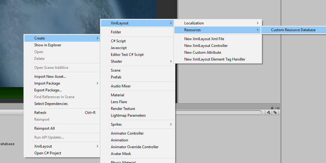
What you name your database file and where you choose to store it is up to you - XmlLayout will automatically pick it up and use it wherever it is.
Please note: if you're building for platforms such as WebGL, it may be necessary to restart Unity in order for the resource database to work correctly (in the build).
Locating assets for the database
There are three methods of locating assets for your new custom database:
-
Monitoring the current folder: (Recommended)
If you select the 'Monitor Current Folder' checkbox, then this database will monitor the folder it is currently located in (as well as any subfolders). Be sure to also check the 'AutomaticallyRemoveEntries' checkbox in order for this database to be entirely self sufficient.
If this method is chosen, then you will not be able to edit the folders collection (as it will be controlled by this property), but apart from that, it works exactly as if you had specified the current folder this database is located in.
-
Specifying folders:
Your new database has a 'Folders' property which is a collection of string values. Each of these values specifies a folder that this database should monitor for assets.
The paths should be specified from your Assets folder, e.g. if your folder is stored in "Assets/Some Folder/My Assets", then you should provide a value of "Some Folder/My Assets".
If new assets are added into a folder monitored by a custom resource database, they will automatically be added to the database.
If you'd like the database to also automatically remove entries for resources that have been removed/etc, then ensure that the 'AutomaticallyRemoveEntries' checkbox is selected.
The paths generated by this method are similar to those generated by Unity's Resources Folder system - the paths of each asset will always be relative to the folder they were found in (as specified by the 'Folders property). If you'd like to see the path used by any particular asset, you can find it in the 'Entries' collection below.
Note: As with Unity's Resources folders, Custom Resource Databases support assets located in subfolders.
-
Speciying individual assets:
You can also manually add entries to the database by adding values to the 'Entries' collection, specifying both a path and the asset itself.
Using this method, you can specify and use any path value you wish. However, if you do use this method, then ensure that 'AutomaticallyRemoveEntries' is not selected, or your custom entries will automatically be removed.
Any changes made to a custom resource database will be picked up by XmlLayout and will be available for immediate use.
</CreatingCustomXmlLayoutResourceDatabases>
Adding Custom Resources at Runtime
Requires XmlLayout v1.23 or greater
You can now add assets to the main resource database at runtime by using the new AddResource method, e.g.
XmlLayoutResourceDatabase.instance.AddResource("MyNewSpritePath", myNewSprite);Once this has been done, the new asset will be available for use by XmlLayout immediately, but it must always be done before XmlLayout attempts to use it.
This method can be used to override resources loaded by XmlLayout from Resource folders, although it will not override entries added to custom resource databases.
</AddingCustomResourcesAtRuntime>
Localization
Requires XmlLayout v1.14 or greater
Localization Files
An XmlLayout localization file stores a list of keys and values which will be used to substitute text content in the Xml file. You can swap localization files at any time to change the values displayed in the UI, allowing you to, for example, switch languages.
Adding a new localization file
You can add a new localization file by opening the 'Create' menu from the top menu bar, or by right-clicking in the project window, then selecting Create -> XmlLayout -> Localization -> New Localization File.
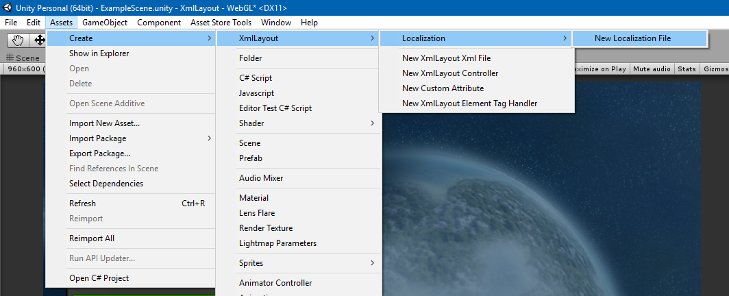
You should then name the file as appropriate - if, for example, the file will be used to contain values for the English language, then you should call it 'English', or perhaps 'EN-US', 'EN-EU', or something along those lines. However, what you choose to call it is ultimately entirely up to you.
If you wish to change languages at runtime, then it is usually best to ensure that the localization file is stored within a Resource Database or Resources folder (alternatively, you can store references to the file in your XmlLayoutController and use those, in which case it does not matter where the file is located).
Please note: You can use the same localization file for as many XmlLayouts as you like - or you can create a different localization file for each XmlLayout, the choice is up to you.
Setting keys and values
To edit a localization file, first select it in the project window.
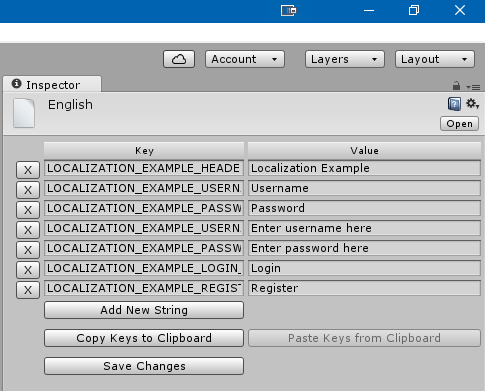
From here, you can modify keys and values, remove entries, add new entries, etc.
When you're done, click the 'Save Changes' button to make sure your changes are stored (otherwise they may be lost).
Copying Keys from one localization file to another
When creating multiple localization files, you may find it repetitive adding the same sets of keys for each file. To this end, the localization file editor provides the Copy Keys to Clipboard and Paste Keys from Clipboard buttons. Use these to copy keys from one file to another, meaning that all you have to do is set the values.
</LocalizationFiles>
Using a localization file
In order to use a localization file with an XmlLayout, you must first populate the XmlLayouts LocalizationFile property.
There are two ways in which you can do this:
- In the XmlLayout inspector, you can set the LocalizationFile property directly; or
- You can set the property in code using
XmlLayout.SetLocalizationFile(XmlLayoutLocalization newLocalizationFile). This can be done at runtime - doing so will force the XmlLayout to rebuild using the new localization file.
Here is a snippet from the Localization Example, which shows how to reference keys/values from the localization file:
Example
<TableLayout>
    <Row class="headerRow">
      <Cell>
        <Text class="title">
          {LOCALIZATION_EXAMPLE_HEADER}
        </Text>
      </Cell>
    </Row>
    <Row class="viewport">
      <Cell>
        <TableLayout cellPadding="8" cellBackgroundColor="rgba(1,1,1,0.1)">
          <Row>
            <Cell>
              <Text class="h3">{LOCALIZATION_EXAMPLE_USERNAME_LABEL}</Text>
            </Cell>
            <Cell>
              <InputField id="username"
                          placeholderText="{LOCALIZATION_EXAMPLE_USERNAME_PLACEHOLDER_TEXT}" />
            </Cell>
          </Row>

          <Row>
            <Cell>
              <Text class="h3">{LOCALIZATION_EXAMPLE_PASSWORD_LABEL}</Text>
            </Cell>
            <Cell>
              <InputField id="password"
                          inputType="Password"
                          placeholderText="{LOCALIZATION_EXAMPLE_PASSWORD_PLACEHOLDER_TEXT}" />
            </Cell>
          </Row>

          <Row>
            <Cell>
              <Button>{LOCALIZATION_EXAMPLE_LOGIN_BUTTON}</Button>
            </Cell>
            <Cell>
              <Button>{LOCALIZATION_EXAMPLE_REGISTER_BUTTON}</Button>
            </Cell>
          </Row>
        </TableLayout>
      </Cell>
    </Row>
  </TableLayout>
As you can see, you can use localization keys anywhere in the Xml file where text is supported.
For more details, including showing how to change localization files at runtime, see the Localization Example.
</UsingALocalizationFile>
Customising XmlLayout
Custom Attributes
If you wish to add custom attributes of your own which apply to one or more element types, then you can create a CustomXmlAttribute which will define how to handle it.
Please note that if you wish to create an attribute for a single tag, and that tag is a custom tag (see below), then it is not strictly necessary to create a CustomXmlAttribute as the attribute can be handled by the TagHandler if you wish.
Creating a new CustomXmlAttribute
In the Project window, right-click the folder in which you wish to store the CustomXmlAttribute code.
Then, select Create->XmlLayout->New Custom Attribute

You will then be prompted to enter a name for the new attribute's C# file. You will also need to change the name of the class in the file itself.
Naming Custom Attributes
Custom Xml Attributes use a strict naming standard, which must be followed if the attribute is to be matched in Xml. The format is as follows:
MyAttributeNameAttribute
This would match the Xml attribute 'myAttributeName', e.g.
<Element myAttributeName="myAttributeValue" />Once the CustomXmlAttribute has been added to the project and named correctly, it will automatically be located and used by XmlLayout.
CustomXmlAttribute Virtual methods/properties
The CustomXmlAttribute class defines two virtual methods and several virtual properties which you can override to define how this attribute behaves:
Methods
- Apply() - This method allows you to alter the element directly as required by the attribute's value.
- Convert() - This method allows you to define and return new attribute values which will be processed (effectively allowing you to translate one attribute into one or more others).
Your Custom Xml Attribute may implement one or both of the above methods.
Properties
- RestrictToPermittedElementsOnly - If this property returns true, then this attribute will only be applied to elements in PermittedElements. If this property returns false, then it will be applied to any element. Default: False
- PermittedElements - Defines which elements this attribute may be applied to.
- KeepOriginalTag - If this property returns true, then this attribute will remain in the list of attributes after it has been processed by this CustomXmlAttribute. If it returns false, then the attribute will be removed after processing. Default: False
- ValueDataType - This specifies the xml data type of this attribute for autocomplete/xml validation.Default: xs:string
- AttributeGroup - This specifies which elements this attribute may be used on (for autocomplete/xml validation). Default: AllElements
For examples of CustomXmlAttributes, see the Assets/UI/XmlLayout/CustomAttributes folder.
</CustomAttributes>
Custom Tags
If you wish to create custom tags of your own, then you can create a new ElementTagHandler which will define how to handle it.
Creating a new Element Tag Handler
The first step in creating a new Element Tag Handler is to create a prefab which will serve as the 'base' for the element.
For examples of tag prefabs, look in the Assets/UI/XmlLayout/Tags/Resources/XmlLayout Prefabs/ folder.
Once you have created a prefab, you will then need to create the Element Tag Handler class.
In the Project window, right-click the folder in which you wish to store the Element Tag Handler code.
Then, select Create->XmlLayout->New Element Tag Handler
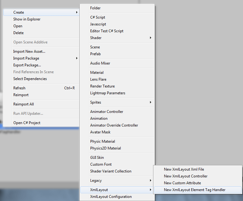
You will then be prompted to enter a name for the new attribute's C# file. You will also need to change the name of the class in the file itself.
Naming Element Tag Handlers
Element Tag Handlers use a strict naming standard, which must be followed if the handler is to be matched to an Xml tag. The format is as follows:
MyTagNameTagHandler
This would match the Xml tag 'MyTagName', e.g.
<MyTagName />Once the Element Tag Handler has been added to the project and named correctly, it will automatically be located and used by XmlLayout.
Alternatively, you can specify a name for your tag handler using the ElementTagHandler annotation (if you do, then the name of your tag handler class can be whatever you wish it to be).
ElementTagHandler Virtual methods/properties
The ElementTagHandler class defines three virtual methods and four virtual properties which you can override to define how this tag behaves:
Methods
-
ApplyAttributes()
This method should be used to process any complex attributes as required by this tag.
In generally, you should call
base.ApplyAttributes()for standard attribute handling - XmlLayout will use reflection to match attributes and their values to the element, which means that most attributes will automatically be used - only complex attributes, or attributes which do not directly match a property on the class need to have special handling set up here.The base ApplyAttributes() method will attempt to match attributes to components in the following order (and will return once it finds a match):
- The Primary Component (as defined by
primaryComponent) - The
RectTransform - The
LayoutElementcomponent (which is automatically added to each element by XmlLayout) - The
XmlElementcomponent (which is automatically added to each element by XmlLayout) - The
Imagecomponent (if there is one)
If this tag does not require any special attribute handling, this function can safely be omitted. - The Primary Component (as defined by
-
HandleEventAttribute()
This method should be used to process event attributes. It will be called for each element defined by
eventAttributeNames(as long as the base ApplyAttributes() method is called at some point).base.HandleEventAttribute()will handle theonClick,onMouseEnter, andonMouseExitevents attributes.For examples of how to implement this method for custom events, see the
UI.Xml.InputFieldTagHandler,UI.Xml.SliderTagHandler, andUI.Xml.DropdownTagHandlerclasses (located in Assets/UI/XmlLayout/Tags).If this tag does not require any special event handling, this function can safely be omitted.
-
ParseChildElements()
This method allows you to control how child elements of this custom tag are parsed, e.g. for tags like Dropdown.
If this method returns true, then XmlLayout will not attempt to parse the child elements itself (as this method has already parsed them).
Default return value: False
If this tag does not require any child element handling, this function can safely be omitted.
Your Element Tag Handler may implement any number of the above methods.
Properties
-
primaryComponent
This property should return the component (MonoBehaviour) which would be considered to be the 'primary' component of this tag. e.g. <Button /> == UnityEngine.UI.Button
This is usually best achieved through the use of
currentInstanceTransform.GetComponent(); Default return value: null
-
prefabPath
By default, XmlLayout will use the following path:
Resources/XmlLayout Prefabs/{Element Name}TagHandlerIf the prefab used by this tag is located in a different location (or is named differently), then override this function and return the correct location of the prefab.
-
transformToAddChildrenTo
Generally, if this element supports child elements, child elements will be added directly to this element's transform. In some cases, however, this is not the desired behaviour, e.g. child elements of ScrollViews need to be added to the ScrollViews content object, not the ScrollView itself.
Default return value: currentInstanceTransform
-
eventAttributeNames
This property defines which attributes will be processed by HandleEventAttribute(). The names of any custom events should be added here.
Default return value: onClick, onMouseEnter, onMouseExit
-
isCustomElement
This should be set to true for all custom tags - this value is checked by XmlLayout to determine whether or not the tag needs to be added to the XSD file (for autocomplete).
-
attributes
This should return a Dictionary<string, string> where the key is the name of the attribute, and the value is the data type of that attribute.
As with isCustomElement XmlLayout uses this value to add custom attributes for this element to the XSD file for autocomplete.
-
elementGroup
This is used by XmlLayout to determine where this tag may be used. The options are:
- Default This tag may be used anywhere, with a few minor exceptions.
- XmlLayout This tag may only be used directly within an XmlLayout tag.
This is only used for XSD generation (autocomplete) and has no bearing on where the element may actually be used.
Additionally, the ElementTagHandler class defines several non-virtual properties which may be useful when implementing custom tag behaviour:
-
currentInstanceTransform
This is the
RectTransformof the element that is being processed. -
currentXmlElement
This is the
XmlElementcomponent of the element that is being processed. -
currentXmlLayoutInstance
This is the
XmlLayoutwhich contains the element that is being processed.
For examples of ElementTagHandlers, see the Assets/UI/XmlLayout/Tags folder.
Attribute Types
When defining attributes to use in your custom tags, specify the Xml type in the 'attributes' property.
| Standard Xml Types | |||
| C# Type | Xml Type | Example Xml Value | Example C# Value |
| string | xs:string | ||
| int | xs:int | ||
| float | xs:float | ||
| boolean | xs:boolean | ||
| XmlLayout Types | |||
| Color | xmlLayout:color | ||
| RectOffset | xmlLayout:rectOffset | ||
| Vector2 | xmlLayout:vector2 | 0 1 | Vector2(0,1) |
| Vector3 | xmlLayout:vector3 | 0 1 2 | Vector3(0,1,2) |
| List |
xmlLayout:floatList | 0.5 1.5 2.5 3.5 4.5 | List |
| ColorBlock | xmlLayout:colorBlock | rgb(0.1,0.2,0.3)|rgb(0.4,0.5,0.6)|rgb(0.7,0.8,0.9)|rgb(0.1,0.2,0.3) | ColorBlock { normalColor=Color(0.1f,0.2f,0.3f), highlightedColor=Color(0.4f,0.5f,0.6f), pressedColor=Color(0.7f,0.8f,0.9f), disabledColor=Color(0.1f,0.2f,0.3f) } |
| Alignment | xmlLayout:alignment | MiddleCenter | RectAlignment.MiddleCenter |
| Custom Enumerations |
Special case - specify a comma delimited string, eg.: ValueOne,ValueTwo,ValueThree,ValueFour |
ValueFour | myEnum.ValueFour |
|
Resources E.g. Sprites, Fonts, AudioClips, Xml Files, etc. |
Just uses a string value, so use 'xs:string' | Sprites/SomeSprite | Unity Sprite object |
</CustomTags>
Using custom prefabs with existing tags
If you wish, you may substitute the default prefab used by an existing tag by setting the prefabPath attribute to the path of your choice.
It is highly recommended that you ensure that any custom prefabs contain the required components (e.g. prefabs for the Button element should always contain a Button component) in order to prevent errors from ocurring.
</UsingCustomPrefabsWithExistingTags>
Custom Xml Tags
As of XmlLayout v1.73, a new base Tag Handler class has been provided called BaseXmlTagHandler.
This tag handler extends the base tag handler, and as such provides all of the same functionality, however, it also allows you to specify custom Xml, so you can create your own Xml-based custom tags.
Tags implemented using this approach are very similar to ChildXmlLayout tags, but they allow you to provide additional functionality.
The following properties are provided, which you can override to specify how the tag handler should function:
-
Xml
This property directly specifies the Xml for this tag to use. Only override this property if you wish to specify the Xml directly in the code.
-
XmlPath
If not using the 'Xml' property, this will specify the path to the Xml document to use for this tag. This path must be accessible to XmlLayout (via a Resource Database/Folder)
-
ControllerType
This is an optional property allowing you to specify an XmlLayoutController to use for this tag.
-
PrimaryComponentType
This is an optional property allowing you to specify a component to use as the 'primary' component of this tag. If this property is overriden, then a component of this type will be added to the element.
Note: if you override the ApplyAttributes() method in your custom Xml Tag handler, then it is important to call base.ApplyAttributes() in order for the tag to function correctly.
Example
[ElementTagHandler("TestXmlTag")]
public class TestXmlTag : UI.Xml.Tags.BaseXmlTagHandler
{
    // Specify the Xml directly
    /*public override string Xml
    {
        get
        {
            return @"<Panel color=""red""></Panel>";
        }
    }*/

    // Specify a resource path to load an Xml file
    public override string XmlPath
    {
        get
        {
            return "Xml/DemoOverlay";
        }
    }
}
Usage
<TestXmlTag />
</CustomXmlTags>
Configuration
The XmlLayout Configuration window
To access the XmlLayout Configuration window, open the Assets menu, select 'XmlLayout', and then 'Configuration'.
This will allow you to see and change advanced XmlLayout configuration options.
-
Automatically Update XSD File:
If this option is enabled (default = enabled), XmlLayout will automatically update the XSD (autocomplete) file to match any custom elements/attributes/etc. If you aren't currently making any changes to custom elements/attributes/etc. or importing/removing any plugins, you can disable this for a slightly faster compile time. Under normal circumstances, it is recommended that you leave this enabled.
-
Suppress XSD Update message:
If this option is enabled (default = enabled), XmlLayout will not log a message when updating the XSD file. If the option is disabled, XmlLayout will log a message whenever the XSD file is updated for any reason (which, if the above option is enabled, will be every time scripts are compiled).
-
Allow any attribute:
If this option is enabled (default = disabled), the xsd file will be set up such that you can use any attribute you wish in your Xml without receiving a validation error.
-
Comprehensive Custom Element and Attribute Check:
If this option is enabled (default = enabled), XmlLayout will search through all assemblies it can find for plugins, custom elements, and attributes. Disabling this option will improve compilation time, but may prevent XmlLayout from properly detecting plugins. If you are not using any plugins, then it is safe to disable this option.
-
Custom Assembly List:
If the above option is disabled, you can specify a list of assemblies to search for plugins/etc. Note: this list requires the assemblies full name.
-
Assembly Exclude List:
If the comprehensive check is enabled, you can exclude specific assemblies from the check by adding their names to this list. This list supports partial matches, so you don't need the assemblies full name. A few select assemblies (usually dynamically generated ones) can cause issues with XmlLayout - adding them to this list will usually fix any problems.
-
Use XmlLayout Selectable Navigation:
If this option is enabled (default = enabled), then XmlLayout will automatically handle Selectable navigation in your project. If you'd like to use a different system, disable this option.
-
Manage Assembly Definitions Automatically:
If this option is enabled (U2018+ only), then XmlLayout will automatically generate assembly files for itself and any installed Digital Legacy plugins. Under normal circumstances, it is probably best to leave this option disabled and only use the options below to manually generate these files when necessary.
-
Generate Assembly Definition Files:
Clicking this button will generate assembly files for itself and any installed Digital Legacy plugins. This will split XmlLayout and any plugins into their own assemblies, which can improve compilation time by having Unity only recompile assemblies that have actually changed, rather than everything.
-
Delete Assembly Definition Files:
Clicking this button will have XmlLayout delete any assembly files that it has generated, reverting the project to its previous state.
-
Regenerate XSD File Now:
Clicking this button will force XmlLayout to regenerate its xsd (autocomplete) file.
-
Disable/Enable MVVM Functionality:
Clicking this button will enable or disable MVVM functionality. When MVVM is disabled, it will be excluded from compilation which may slightly improve compile time, and also may be useful if for example you wish to use .NET 2.0 (as of recent versions of Unity 2018, .NET 2.0 no longer contains the Remoting namespace, so MVVM is no longer compatible with .NET 2.0. With MVVM disabled, XmlLayout can still be compiled for .NET 2.0).
</TheXmlLayoutConfigurationWindow>
Plugins
Installing plugins
By default, XmlLayout will automatically pick up plugins that are installed (such as PagedRect or TextMeshPro).Removing plugins
When you remove a plugin, compilation errors may be shown as XmlLayout will still reference them. You can rectify this by using the 'Assets/XmlLayout/Fix Symbol Definitions' menu item.
As such, the recommended practice for removing a plugin is to delete the plugin files, and then click the menu item. If you're using assembly files, you may need to also tell XmlLayout to generate them so as to remove any references to the plugin.
</Plugins>
Best Practices
Modifying internal XmlLayout code
It is best not to modify internal XmlLayout code as any changes made will be lost when updating to the latest version, and may also lead to unexpected behaviour.Resources folders
As of v1.23, with the addition of CustomXmlLayoutResourceDatabases, XmlLayout no longer requires you to use Resources folders. Unity recommmends that you don't use Resources folders, so, unless you need the assets used by XmlLayout to be in Resources folders for some other reason, it is recommended that you move your assets over to a custom resource database. To do so, simply rename the existing Resources folder to the name of your choice, then add a custom database asset to the folder and set it to 'Monitor the Current Folder'.Updating XmlLayout
In general, it is best to delete the existing XmlLayout installation when updating XmlLayout to a later version. While updating without deleting the original installation will often work, it may lead to unexpected issues.
If you wish to preserve your configuration settings, back up the UI/XmlLayout/Configuration/Resources/XmlLayout_Configuration object before updating, and then restore it once the update has been imported.
</>
All content Copyright© 2016-2026 Digital Legacy Games. All rights reserved.