Introduction
DatePicker is a powerful control for date selection using the UnityUI.Features:
- Use inline or popup DatePicker controls
- Select either a single date, or a date range.
- Highly customiseable appearance and functionality.
Note
Please note that if you are using v1.11, there is an issue with building for any non-editor platform which can be resolved by replacing SerializeableDate.cs with this version (change the file extension to .cs). If you are using v1.12 or above, then there is no need for this change.
Working with DatePicker
Adding a new DatePicker
To add a new DatePicker object, right-click the desired location in the hierarchy window, and select
UI -> DatePicker -> (Prefab of your choice).
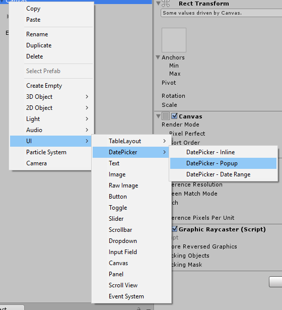
The various prefabs each have their own intended purpose:
- DatePicker - Inline : This is a DatePicker which is always visible.
- DatePicker - Popup : This is a DatePicker which is attached to an InputField. The DatePicker is hidden except when being used to select a date. It will automatically be positioned relative to the InputField (by default, it will appear below it, unless there is not enough space on the Canvas in which case it will appear above it).
- DatePicker - Date Range : This prefab combines two Popup DatePickers which allow users to select a date range.
</AddingANewDatepicker>
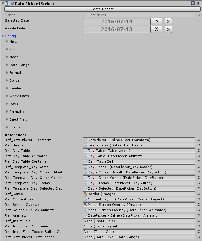
The DatePicker Component
-
Force Update
Under normal circumstances, the DatePicker will automatically update whenever any changes are made to any of its properties. However, if this does not occur, you can force an update by clicking this button at any time.
-
Selected Date
This is the date which is currently selected by this DatePicker - this can be null. You can use the in-editor DatePicker button to select a date, and you can clear the selected date by clicking the 'X' button.
-
Visible Date
This is the date which is currently visible in this DatePicker - use this value to specify which year/month are shown in the DatePicker (the day is irrelevant). By default, this date will match the selected date, although this behaviour can be changed by the Misc -> Switch To Selected Date When Date Selected
-
Misc
-
Switch To Selected Month When Date Selected
If this value is set, whenever a date is selected in the DatePicker, the Visible Date will be updated to match. What this ultimately means is that when a date is selected in a month other than the currently visible month, then the DatePicker will automatically switch to that month.
-
Show Dates In Other Months
If this value is set, then dates that do not fall within the current month will be shown on the DatePicker if the month does not start on the first day of the week, and/or does not end on the last day of the week.
-
Close When Date Selected
If this value is set, then the DatePicker will automatically be hidden when a date is selected. This is mostly useful for popup DatePickers.
-
Switch To Selected Month When Date Selected
-
Sizing
-
Override Transform Height
By default, the height of the DatePicker will be determined as the height of its RectTransform. If, however, you wish to control it manually here, then you can set this option.
-
Preferred Height
This is the height you wish the DatePicker to be if 'Override Transform Height' is set.
-
Override Transform Height
-
Modal
-
Is Modal
If this is set, then an overlay will be shown beneath the DatePicker, preventing the user from interacting with anything other than the DatePicker.
-
Close When Modal Screen Overlay Clicked
If this is set, then the DatePicker will be hidden if the screen overlay is clicked.
-
Screen Overlay Color
This allows you to specify the color of the screen overlay.
-
Is Modal
-
Date Range
-
Restrict From Date
If this is set, then the user will be unable to select any dates prior to 'From Date'
-
From Date
The date restriction for 'Restrict From Date'
-
Restrict To Date
If this is set, then the user will be unable to select any dates after 'To Date'
-
To Date
The date restriction for 'Restrict To Date'
-
Restrict From Date
- Format
-
Border
-
Size
This specifies the size of the border for the DatePicker (0 indicates that no border should be visible). You can specify the border size for each side individually.
-
Color
This specifies the color of this DatePicker's border.
-
Size
-
Header
The header is the part of the DatePicker which shows the currently visible year/month, as well as the optional next/previous month and year buttons.
-
Show Header
If this property is not set, then the header will not be visible.
-
Background Color
This property controls the background color of the header.
-
Text Color
This property controls the text color of the header.
-
Font
This property specifies which font should be used for the header.
-
Height
This property specifies the height of the header.
-
Previous Month Button / Next Month Button / Previous Year Button / Next Year Button
These properties control the appearance of the respective buttons.
-
Show Header
-
Week Days
The appearance of the week day headers is controlled by the DatePicker -> Templates -> Day Header object. You may modify this template directly, or simply change some of the following properties (or both):
-
Override Template
If this value is not set, then none of the following properties will take effect. If it is, then the values set here will override any values set on the template.
-
Text Color
This specifies the text color for the week day headers.
-
Font
This specifies the font to use.
-
Background Image
This specifies the background image (if any) for each of the week day headers.
-
Background Color
This specifies the background color to use for the week day headers.
-
Override Template
-
Days
As with the week day headers, the appearance of the days are controlled by templates - DatePicker -> Templates -> Various Templates for each day type. A different template is used for each day type. The day types are as follows: Selected Day, Today (if not selected), Days that fall within the visible month (if not selected), and days that fall outside the visible month (if not selected).
-
Background Color
This controls the background color of the entire day area.
-
Font
This controls the font used by all days.
-
Current Month / Other Months / Today / Selected Day
-
Override Template
If this value is not set, then none of the following properties will take effect. If it is, then the values set here will override any values set on the template.
-
Text Color
This controls the text color of this day type.
-
Background Image
This controls the background image of this day type (if any).
-
Normal Color
This sets the default background color of this day type.
-
Highlighted Color
This sets the background color of this day type when it is highlighted (by hovering the mouse over it or otherwise selecting it).
-
Pressed Color
This sets the background color of this day type as it is pressed.
-
Disabled Color
This sets the background color of this day type when it is disabled (e.g. if it falls outside of the available date range).
-
Color Multiplier
This controls the intensity of the color changes - the default value of 1 is reccomended.
-
Fade Duration
This controls how long the color changes will take to fade into one another, a value of 0 will remove the fading entirely and make all changes instant.
-
Override Template
-
Background Color
-
Animation
-
Show Animation
This specifies which animation (if any) should be used when the DatePicker is shown.
-
Hide Animation
This specifies which animation (if any) should be used when the DatePicker is hidden.
-
Month Changed Animation
This specifies which animation (if any) should be used when the visible month is changed in the DatePicker. This animation will only affect the days and the week day headers.
-
Show Animation
-
Input Field
The following properties are only relevant if this DatePicker is attached to an InputField (popup DatePickers)
-
Toggle Display When Input Field Clicked
This this is set, then the DatePicker will be shown/hidden when the InputField is clicked.
-
Show Toggle Button
This property controls whether or not the Toggle button should be displayed.
-
Toggle Button Width
This property controls the width of the Toggle button.
-
Toggle Display When Input Field Clicked
-
Events
-
On Day Selected
You can use this property to trigger events when a date is selected in the DatePicker. The selected date will be passed as an argument (as a DateTime object).
-
On Day Mouse Over
You can use this property to trigger events when the mouse is hovered over a date in the DatePicker. The date will be passed as an argument (as a DateTime object).
-
On Day Selected
-
References
Under normal circumstances, you won't need to change any of these properties. They are used to link all of the DatePicker's child components together.
</TheDatepickerComponent>
The DatePicker_DateRange Component
The DatePicker_DateRange component controls two child DatePicker components, allowing the user to select a Date Range (and preventing them from selecting an invalid one).
The configuration of this component is basically identical to a regular DatePicker, except that the configuration changes are applied to both child DatePicker components instead of having to configure them individually.
</TheDatepicker_DaterangeComponent>
Working with code
Setting the selected date
You can set the selected date via the 'SelectedDate' property:Example
// Set the selected date to Today
datePicker.SelectedDate = DateTime.Today;

// Set the selected date to a specific date
datePicker.SelectedDate = new DateTime(year,month,day);

// Clear the selected ate
datePicker.SelectedDate = new SerializeableDate();
</SettingTheSelectedDate>
Adjusting the configuration
You can access all of the DatePicker's configuration properties through the use of its 'Config' property. All of the properties correspond with those in the inspector for the DatePicker Component.
Example
datePicker.Config.Header.BackgroundColor = Color.black;
datePicker.Config.Header.TextColor = Color.white;
</AdjustingTheConfiguration>
Saving and loading configuration
The DatePicker_Configuration object (datePicker.Config) is fully serializeable, so, if you wish, you can easily save the configuration as a serialized string (for example, in a json file) and load it for the same (or other) DatePickers, should you wish to use a global collection of settings.
Additionally, should you wish to do so, you could create one DatePicker as a 'master' and then override other DatePicker configurations with its .Config value.
The only restriction to keep in mind is that events are unlikely to work after being deserialized, especially if loaded from a different DatePicker.
The Get and Set serialized configuration methods are available from DatePicker v1.23.
Example
// get the configuration serialized as a json string
string json = datePicker.GetSerializedConfiguration();

// set the configuration from a serialized json string
datePicker.SetConfigFromJsonString(json);

// set one DatePicker to use the Configuration value from another
// Bear in mind that the Config object is copied, not referenced,
// so changes to one datePicker's configuration will not affect the other
// unless you overwrite the config again
datePickerB.Config = datePickerA.Config;
</SavingAndLoadingConfiguration>
Localization
By default, DatePicker will automatically handle localization using the current .NET Culture, including both the day names, and which day weeks start on (e.g. Sunday or Monday).
If you'd like to change the current culture, you can do so as follows:
Changing the Current Culture
System.Threading.Thread.CurrentThread.CurrentCulture = new CultureInfo("en-us"); // where 'en-us' is the desired cultureYou can also customise the culture as follows:
Customising the Current Culture
var newCulture = new CultureInfo("en-us");
newCulture.DateTimeFormat.FirstDayOfWeek = DayOfWeek.Sunday;
newCulture.DateTimeFormat.AbbreviatedDayNames = new string[] { "Sun", "Mon", "Tues", "Wed", "Thurs", "Fri", "Sat" };

System.Threading.Thread.CurrentThread.CurrentCulture = newCulture;
Here is a complete example - simply place this class in your assets folder and modify the culture code:
Complete Example
using UnityEngine;
using System.Globalization;

#if UNITY_EDITOR
[UnityEditor.InitializeOnLoad]
#endif
public static class SetLocalization
{
    [RuntimeInitializeOnLoadMethod]
    static void InitLocalization()
    {
        // replace "en-US" with the culture of your choice
        System.Threading.Thread.CurrentThread.CurrentCulture = new CultureInfo("en-US");
    }

    #if UNITY_EDITOR
    static SetLocalization()
    {
        InitLocalization();
    }
    #endif
}
If you'd like to set DatePicker's localization without changing the current culture, please send a mail to @ [email protected] and we'll look into adding the feature for you!
</>
All content Copyright© 2016-2025 Digital Legacy Games. All rights reserved.